Or… “The Designer is not equal to the Artist”.
The perfect design. The perfect logo. The perfect… something. We all strive for perfection. Or well, at least I hope we all do. At least I’m “guilty” of this all the time. I firmly believe that if you’re going to do something, give it your all and do it awesomely! If you’re not going to bother doing it properly, don’t bother doing it at all. This belief vibrates through my entire being and it’s the reason I get fucking angry when people ask me do less than what I can. But in our pursuit of this perfection isn’t it reasonable to think that we made many failures getting there? So why do we make such efforts to hide our failed designs?
Design is an iterative process after all so wouldn’t it make more sense that we actually display the process… the iterations… behind it all. My wife would disagree and so would apparently Michelangelo who interestingly destroyed pretty much all of his “process documentation”.
Michelangelo was, if anything, ashamed of his drawings. In his thinking the ‘art’ stage of creative production, which he identified with the careful procedure of making studies, sketches and working drawings, was the menial and mundane side of the business, whereas true merit was to him displayed in the rapid and apparently effortless execution of a painting or sculpture. The Art of Work
Michelangelo wanted to be perceives as a genius. A genius who didn’t have to make any effort for his results. But here’s the thing. Michelangelo was in every sense of the word an… Artist. You are not. Designing a website or a logo is a job. But I suppose I should define how I see design.
To me. Art is Art, because it exists without a purpose, or rather the purpose it has… is to express itself. It exists solely for the purpose of existing. Design, on the other hand, always has a purpose. It is born with a purpose, whether that purpose is to raise awareness for a brand or attract people to a website it all really boils down to is essentially money. The purpose is money and why shouldn’t it be? We’re in the business of design, aren’t we? Somehow the business side of design seems to have gotten lost between whining about difficult clients and being angry at businesses like 99designs.com.
You know why 99design.com and places like that exist? Because there’s a — surprisingly — large number of people who are just tired of the self-entitled “Designers” who think they have a right to waste someone else’s money with their deep-seated need for self-expression. Sure there’s a place for self-expression. That’s why I like expressing myself by painting, sculpting, composing music etc. Basically all the things I do that no one pays me for. I do all of these things because I love them and of course it should go without saying — but I’ll say it anyway — that I love designing too but it’s also a job. I have decided to make something I love doing, into a job and well… I actually count myself lucky to be able to get paid doing what I love.
Now — I don’t remember if I’ve said this before but — don’t get me wrong. Design has a lot of artistic merit and many of the skills are transferable but whilst one thing is about “saying something” the other is about money. And you should stop thinking that they’re both about “saying something”. You’re ruining it for everyone.
I would like to mention websites like dribble and forrst because a part of me hopes that these communities could become places were designers alike share their process and the failures of design. Sadly so far, that is not the case. It seems to be mostly trend-following were one “Designer” tries to best another to make themselves look better. And whilst there are certainly some sharing of iterations of e.g. logos it’s still skewed by angled photos of screens and made to look presentable. Too presentable, making it difficult to see it for what it actually should be; The design that occurs when no one else is watching. A failure. A beautiful, raw failure.
So, I suppose to “put my money where my mouth is” I should start by sharing my process… my failures — or at the very least — some parts of them. And what better place to start then my recent rebranding from Fiinix Design to Carlos Eriksson. You might recognise the old logo in the image below. Believe it or not, the colours I have now are an evolution of the original pink/lime palette I used to have.
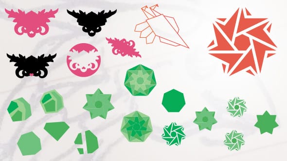
I knew I wanted to get away from the Phoenix bird metaphor because well… it’s a cliché and I don’t want to associate myself with being a cliché. But as you can see — in the red outlined silhouette — I still ended up rethinking the bird concept because… well, you never know. A few sketches on paper and some drawing in Illustrator and I quickly scrapped the idea… for now. After playing around with some “diamond in the rough” metaphors I then turned my gaze to geometry and something I like to call Stressed Symmetry. I don’t know what it’s actually called but it’s basically asymmetrical symmetry, if that makes any sense? I’m enjoy the structured nature of symmetry as a contrast to the chaos that exists inside my head at the same time… something has to be “off” because — at least to me — personality lies in the flaws and defects.
Which is where I am now. A heptagon shaped logo that is parts perfectly symmetrical and parts just a little “off”. This is not the final logo of my rebranding but this is where it’s currently at. The tomato red design in the upper right corner, that is.
The hues of green in the image were ideas in the iteration and did not make it to the final Carlos Eriksson palette.
So, I showed you mine…