Today I thought I would talk to you about ranks.. and more specifically about rank symbols, like the ones used by the army and many games that feature an online multiplayer competitive component. Is this relevant to my thoughts on the subject matter? Well, for the most part it’s not but both of them did serve as inspiration when redesigning our ranks and their respective symbols.
But first for a little back story for those who don’t know the back story. Back in September when we launched our NHL Statistics Website (we still haven’t figured out a catchy name) there were 17 ranks with Titles, divided over 5 classes. They, in turn, were visualized by different shield colours for classes and Roman numerals and letters to signify specific ranks. I won’t list all of the titles but here’s some examples and a complementary picture to better illustrate my example.
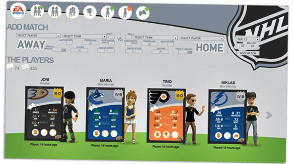
As “Drafting Potential”, the rank you start at, you would have a Silver shield and a rank “symbol” of IV-A, fourth (IV) class from the top, and first (A) within that class. As “Defensive Leader” III-C you would have a Gold shield and of course third (III) class from the top and third (C) within that class.
You get the idea I hope?
Problem with this was, mostly, was that although very clear and to the point, it was boring and too reminiscent of Finnish beer’s tax classes.
So, for update 3.1 the “symbols” were rethought into actual (non quotation required) symbols. So instead of D you get 1 chevron (insignia), C becomes 2 chevrons, B becomes 3 chevrons and A becomes a star. The colour of the shield tells which class you are in.
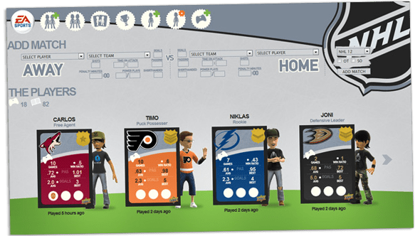
Now this seems pretty fine doesn’t it? Assuming you are accustomed to the basic in military ranks, it makes a lot of sense that 3 chevrons are better than 1, but a star triumphs them both. There is one glaring problem though as one of our more active players commented on and rightfully so. In the picture above it’s pretty cut-and-dry… in the picture above, everyone is in the same class. In reality we’re not all in the same class. And as the previously mentioned player commented, “One might not necessarily know that the reddish-brown shade represents Bronze, and if one doesn’t understand the relationship between e.g. the colours Bronze and Silver (reddish-brown and medium grey) then you have now way of telling which is better.”
Obviously Silver is better than than Bronze, but it’s not obvious through the colours alone. Never mind the fact that people usually don’t have calibrated displays anyway and as such there’s no way to ensure the colours come out right.
So.. back to the drawing board for update 3.2. The chevrons were and are a good way to visualize various ranks, but they needed to be expanded so that every rank had its own symbol, rather than reusing the same four symbols over and over again. Taking much more inspiration from the Halo series ranks and various military ranks we (me and Mr. Cruise) threw some ideas around and ended up with this.
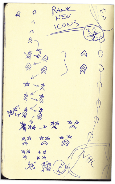
A very quick sketch, but an outline of our ideas nonetheless. The basic concept being that of a linear progression in rank symbols. Some element needs to be reoccurring so that one can compare any rank within a class to any other rank within another class. One should be able to tell the relationship between symbols without shield colours. We also expanded the original 17 ranks to 24 ranks, to even out the lower end of the spectrum which was sorely lacking in ranks and added a new class under Bronze called Blood. Blood is meant to symbolize that everyone is making you bleed through defeat as well as serve as a warning colour that your rank is very low.
After this sketch I jumped to Illustrator and started tinkering with various symbols, one including a 7-point star that got scrapped later on. In the end, this is what we ended up with.
Much better wouldn’t you agree? And because we also calculate statistics for some recent activities such as “recent win ratio” and “recent passing average”, recent based on the 13 latest games I also designed a symbol for “Unranked” players, that is, player who have less than a total of 13 games. The rank symbols and shields are all designed in Illustrator for that vector-y goodness, then imported into Photoshop for final adjustments and preparing them for web use.

Before this it was too easy to confuse an intermediately ranked player with a new player, because both are likely to be titled “Drafting Potential”. A limitation in part because of how the Elo rating system is designed and because we decided against having two systems, one rank rating and one experience rating. Although we have three slots for Career Trophies, trophies which can only be achieved through active playing. So I suppose that’s something.
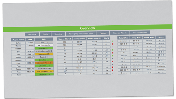
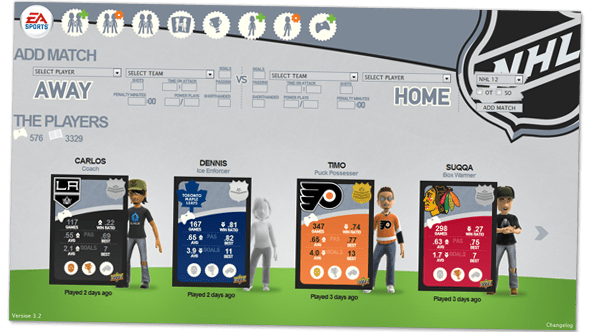
I think that will be all of my rank-ramblings for this time. Any questions? Don’t hesitate to comment. And in the meantime I will grace you with a preview of update 3.3, adding the much requested, sortable statistics tables. Featuring statistics that aren’t available anywhere else, mostly because of lack of space. The cards are pretty crammed with information already.