I have a surprise for you people (I don’t know yet if it’ll be a good surprise or a bad one). I won’t blog about it yet, because I’m still waiting for the opportune moment to tell the world. So until then you’re all going to have to settle with this. No.. don’t cry.. it’ll be alright.. I promise.
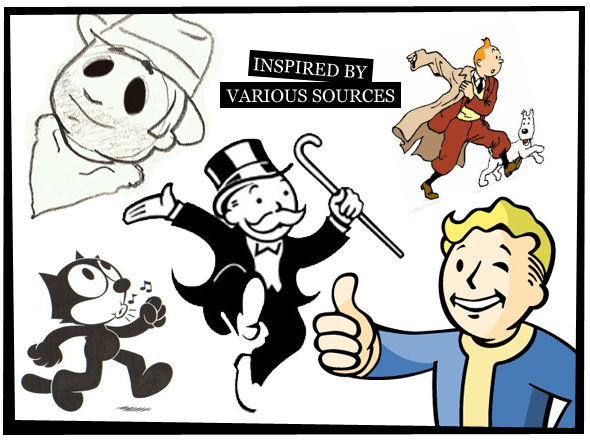
Anyways. Many people (two at least) have commented that my character “Jack Jones” for Island of Eternity looks very similar to Vault boy from the Fallout series. So yeah, I feel like clearing up a few things, for various reasons.
The graphics you have seen have always been (unless specified) borrowed, inspired by and/or outright stolen for the purpose establishing a theme. The theme for Island of Eternity was always going to be a bit 50’s Pulp. Hence it made sense to use graphics from an already established theme that fit nicely with mine. In hindsight, maybe I shouldn’t have used any theme at all. So you thinking “Hey, that looks like the Fallout dude”. My responds is, and will always be “Why yes, the character is partly inspired by Vault Boy from the Fallout series”. But “Jack Jones” is inspired by many other character as well. Such as Felix the Cat (1919), Tintin (1929), Rich Uncle Pennybags (1936) to name a few.

How’s that? Well.. I do my research. And I do it well. In trying to make a game, which is to be themed as partly 50’s Pulp and such, I researched character design of that time, of course with a bit of artistic freedom here and there, but in the end, with one single goal. Design a character that feels familiar and aged. A character that feels like it’s existed since circa 1937. So there. The final revision of “Jack Jones” will still feel familiar, but rest assured. It will very much be my design. Not stolen. Not borrowed. But definitely inspired by.
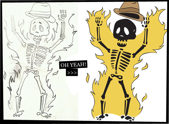
Any questions? Feel free to comment. Until the surprise though, like I said, you are going to have to settle with this. And one card illustration which is complete, though I haven’t decided if I will use this illustration yet, since that might mean that “Break á Leg!” would have to be renamed to “Flammable!”, and I kind of still like “Break á Leg!” so I’m torn. So why do an illustration for a card I might not use? Well, to get some practice in using Adobe Illustrator for one thing and besides I could still use it in some promotional use even if I don’t use it as a card.

Until my surprise, I hope this is okay for now.