Some time ago.. like over two years ago, I made some movie genre posters. Mostly because at the time there weren’t any. I had/have XBMC running on an old Xbox 1 as my main source of awesome entertainment in the living room and decided that I wanted to have my movies sorted according to genres. So yeah, at the time there weren’t any, because apparently people hadn’t felt that need.. or some other reason.
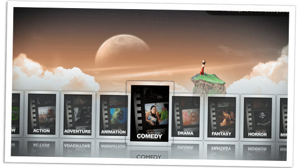
So what did I do? Well obviously I made my own genre posters, figuring that at the very least than I could make them look like whatever I desired. And “The Reel, Movie Genre Posters” where born. I came up with that name recently, catchy isn’t it? At that time I was quite an active member of the forum at xbmc.org so I happen to stumble upon someone asking about movie genre posters, some time after I had made them. I quickly posted a picture of them, wondering it they had something like this in mind? And suddenly a whole bunch of people started asking where I got those, and how they could get them too. Well, since I am a big fan of sharing.. I still am. I gave them what I had, which at that time was 15—in my mind “okay” looking posters—they loved them, apparently.

Encouraged by this I started thinking how I could improve them, since I had never made them for anyone but myself to begin with. I still remember playing around with some ideas in Photoshop using slightly differently styled film reel frames. It all felt a bit lacking. Then I started playing around with a more black and white look, thinking that it would be able to fit better with all the different skins that were available to XBMC.

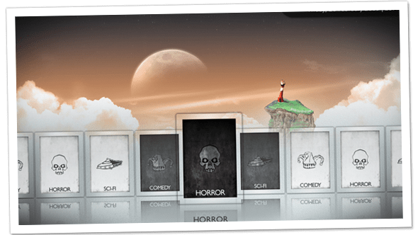
So yeah.. my first experiment with less coloured ones looked like this, pretty crappy ey? I didn’t like the text there, because it constricted the posters to English, but at the same time they seemed a bit lacking such a small picture. But at least I was getting closer. Then it hit me! Silhouettes, silhouettes would be very symbolic and also speak to people on a more primal level, no need for any text, the images themselves would say all that needed to be said.
And so, “The Silhouettes” were born. Again, catchy isn’t it?

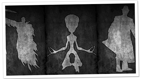
And this is what they looked like.. all 69 (current amount) of them. Yeah, I went a bit over-board and made significantly more of them this time, so there would be enough for most of the genres that exist. They were very well received and as such are now very much a part of many XBMC skins by default, which I think is totally awesome and I fully support it. Actually I think almost all the major skins for XBMC nowadays has my posters as default, if not The Silhouettes, they usually have The Reels. Which I made a template for and “digitalhigh”, another member at XBMC forum expanded on my original concept of measly 15 posters, to the much better amount of 42. Kudos to you “digitalhigh”!
So.. if this was over two years ago, why talk about it now?
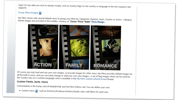
Because, not only do these posters have a wonderful home at XBMC.. They are more and more becoming the standard—to this day, I haven’t seen any other genre posters other than the ones I have designed—in other media centers too. Which is just freaking unbelievable.. in an awesome way. As of September the 24th, my posters now officially have a home at mediaportal too. You can read about in the post “The Future is Here!”. My name is totally in the article. So yeah, that’s why I’m talking about it now, to shamelessly plug my own awesome-ness.

Interestingly enough, people still seem to like The Reels as much as they like The Silhouettes, which to me is a little odd though. Mostly because The Reels still feel a little like that weird cousin one is ashamed of, whilst The Silhouettes are my proud offspring.
Different strokes I suppose, but I’m still greatly honoured that they are so appreciated.