A few days ago I was sitting around and sketching, trying to flesh out an idea I have for a painting — more on that at a later date — when I found myself sketching something that really had very little to do with the painting. But I kind of liked how it looked and the feeling of nostalgia that it woke in me.

Segue to today and this morning when I woke up at 7.30 — Children. They’re a blessing, am I right? — and whilst I was mindlessly brewing my morning coffee I remembered those two small and insignificant — but strangely memorable — sketches I had made the other day. As I looked at them again, it hit me! I have to draw the Carlos Eriksson avatar in different styles, in homage to the great artists whose work has inspired me throughout my life.
First up — for no particular reason — Hanna-Barbera Productions, Inc. with creations such as The Flintstones, The Jetsons and Scooby-Doo.
First things first though, as I’m sure you’re dying — figuratively — to see what those two sketches look like.
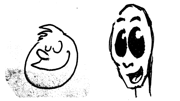
There you go. Now that you know what inspired me, allow me to give you a little back story. When I was younger — like 15 years ago younger — I used to draw my own comic. Don’t worry, I don’t know where they currently are so “No”, I’m probably not going to publish any of them here. Besides they are really fugly. No, seriously, I mean it. Really, really fucking ugly. I happened to stumble on them a few years back and I remember looking through them filled with nostalgia and other warm cuddly feelings. Whilst still thinking, “Oh, wow, these are a lot fucking uglier than I remembered”. So much for rose-tinted shades. I called it “Mixed Comics”, because that’s what it was. Super creative — not even trying to climb out of the box — title, right?
Anyway. Enough about my ugly comic.
I have spent more hours than I’d like to admit — actually I’d be fine admitting it, I just haven’t kept count — with my face deep in studying and figuring out what exactly makes a Hanna-Barbera character… well… a Hanna-Barbera character. Now, I’m going to come right out and say so this hopefully there’s no doubt about my point of view. I am an amateur when it comes to designing and drawing cartoon characters. Whilst I have some experience here and there, there is no way I would consider myself on the level of artists such as Ed Benedict. So, whilst he was great… I’m merely “okay”. Not bad, but also definitely not great.
But then again, he made a career out of something I’ve only ever done sporadically, so maybe I shouldn’t compare myself at all to incredible artists such as Mr. Benedict. With time, passion and endurance I’m sure I could be a lot better than I am. We’ll see.
So. What makes a Hanna-Barbera character? What is it that makes one look at — really any — of their cartoons and almost instantly know that yes, this a Hanna-Barbera cartoon? I almost excluded anything made between 1964 and 1995 — which would have been most of their stuff — because there’s a controversy regarding the quality of Hanna-Barbera productions between that time. The limited budgets television producers had, prevented them in turn from working with the theatrical quality animation they were used to.
But I didn’t exclude any of it. Because you know what? Quality or not, a huge part of my image of Hanna-Barbera animations consists of those awkwardly repetitive running animations, dialogue heavy episodes and very minimal character designs. And those are a direct result of their budgeting techniques. I don’t mean to sound too critical now, I still think their work is awesome. I still have and watch episodes of the original Scooby-Doo series, “Scooby-Doo, Where Are You!”. Children. They really are a blessing, am I right? But you have to admit that some of their animations are… well… done a budget, I suppose sums it up nicely and inoffensively.
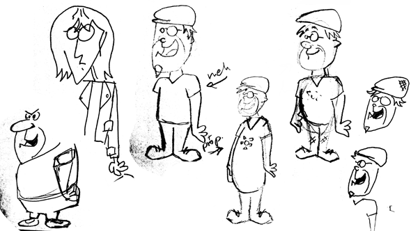
Other aspects that I think give characters that Hanna-Barbera look is how the facial features, like eyes and mouth, are drawn. I also looked a lot at what kind of palette they use for things like skin and Fred Flintstone’s five o’clock shadow.
Unfortunately for me my original avatar — inspired by my Xbox avatar of course — lacks a few almost essential features for good character design.
One, I never drew any eyes for him. He instead wears glasses that for some reason aren’t transparent. Which is just stupid because I can’t think of a single memorable character in the universe, who also has no eyes. Eyes are a great focal point and imbue a character with such personality. Why didn’t I draw any eyes for him?
Two, speaking of personality, my avatar clearly has none. At least none to speak of. There he stands, arms hanging to the sides, legs in normal stance and looking… well… at something. A good — no, great — character design is one you easily recognise, even when presented in a single colour silhouette. The possible best but definitely easiest way to great character recognition? Great posing of course. In terms of my avatars posing, standing around like an idiot is about as boring as it gets. Unfortunately, this is the character I have designed for myself. In short, there were some of challenges I had to overcome when re-envisioning Carlos Eriksson as a Hanna-Barbera character.
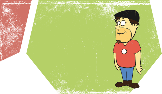
Drum roll please. So, how did I do? Well, I will obviously let you be the judge of that. I’m satisfied with it… for now. The goal was to go from idea to “Done!” in a day, which I did, and here’s the result of that.
I haven’t decided — yet — what to do for the next instalment. Maybe Old School Disney?