You know what I’m talking about.
There I am, sitting on the toilet and pooping whilst surfing Facebook from my phone when suddenly; I’m browsing a website for information and it has a map embedded on it. This website also happens to be responsive which is nice because as you might recall, I’m browsing it from my phone.
And then it happens.
I reach the map and being responsive it spans the entire width—and most of the height—of the viewport.
That’s it, I’m stuck.
I might as well settle down, build a house and wait for death, because from now on I’m forever stuck panning around the Pacific Ocean, never reaching the website’s footer and its allusive email address.
That is, unless I can somehow—using my fat stupid fingers—find a small crevice where the map doesn’t reach so I can scroll down the rest of the page. Which is a terrible user visitor experience.
So, can we make this better?
The idea
The idea itself is quite simple.
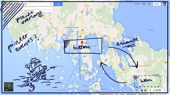
We’ll overlay a ::before pseudo-element on top of the map. It will receive our click/touch events instead of the map, which means we’ll be free to scroll without interacting with the map itself. Using a button we can then toggle to remove the overlay, letting the map receive our click/touch events again.
This is what our HTML markup is going to be like:
<div class="map-container">
	<!-- Google embed code (iframe) here -->
	<button>Toggle</button>
</div>
But because we want our iframe to be fluid rather than fixed and still have to provide it with an actual width and height in the markup—otherwise it defaults to 300 × 150 px—we’re going to have to have to come up with a different way to get it fluid.
Cue intrinsic ratios, which allows browsers to determine the iframe’s dimensions based on the width of its containing block. In our case that’s going to be 100% and by adjusting the padding-bottom we can change the aspect ratio to always be appropriately sized for any device. Whether that’s 16:9, 4:3, or something else.
Intrinsic ratios uses position: absolute to position the iframe though, which means our overlay is now behind our map.
By changing the stacking order, like in the example below, we can get our elements back in the correct z-order.
/* Illustrative code to show the stacking order */

.map {
	z-index: 1;
}
.overlay {
	z-index: 2;
}
.button {
	z-index: 3;
}
Our button only needs to take care of toggling a couple of class names, one on the map container and another one for the button itself. The CSS takes care of the rest.
By changing our ::before pseudo-element’s pointer-events value from auto to none we can tell our overlay layer to not receive our click/touch events. This will then go to the element “underneath” it, which thanks to our revised stacking order is the .map layer.
The result
See the Pen Better Map Experience for Touch Devices by fiinix (@fiinix) on CodePen.
And there we have it. Instead of getting stuck inside a map when scrolling the viewport your visitors can now enjoy a less frustrating browsing experience.
I encourage you to have a play with it and improve it. As you can see, I’ve kept the styling to a minimum, i.e. browser defaults ftw, because I don’t want to burden you with my opinions on aesthetic choices.
By the way, we could use the Google Maps API for the map but a more straightforward approach—as we don’t need to deal with API keys—is to use their own embed code, which is why, for the purpose of this demo, that’s what I had chosen. I’m not saying it’s better, just easier.
And although our solution is primarily meant to solve a difficult interaction problem on touch devices—where screen real estate is precious—it will work just as well on non-touch devices, including being accessible for keyboard-only visitors because we’re using an actual <button> element to handle the toggle event.
The limitations
The demo relies on jQuery but you could rewrite it using pure Javascript as well, using querySelector and addEventListener to toggle the class name but I won’t go into that here—mostly because I haven’t looked into a good way of replicating jQuery’s .toggleClass() yet.
The demo also only supports IE11 because it’s the only IE browser with support for CSS pointer-events. In production code you might need to support as far back as IE9 for which I would recommend using jQuery’s—or a pure Javascript equivalent—.fadeToggle() instead, otherwise you end up with our overlay layer still receiving the click events regardless of its opacity.
Alternately you could simply set display: none on the map container when it’s active but at the cost of losing any transition effects.
Questions? Thoughts? Comment down below.