Today is the day Marty McFly have will have arrived. And with hoverboards just around the corner, what better way to celebrate this then by talking about web design. But through the lenses of the past, the present and the future?
Exciting, right?
Let’s start with the past.
By looking back at some of the websites that came before this one we can begin to see how all these websites have contributed in some small way to the version you see before you today.
Sometimes it’s been by understanding what not to do, other times it’s been more of what not to do.
A blast from the past
So let’s go back to 2003 and the oldest website I can find in my personal archive.
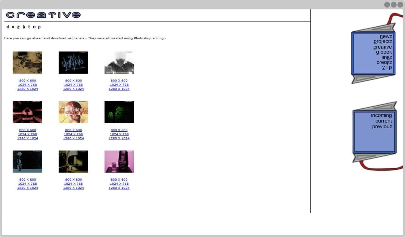
Frames, image-based headings without text equivalents and you had to have Shockwave player installed—in fact I had to install it again just to view the damn thing—just to navigate the website. With no fallbacks of any kind.
So embarrassing.
At least we—I’m pretty sure this was a joint effort by me and Benjamin—gave away free wallpapers for some reason. Would you like one?
There’s little other redeeming qualities about this website aside for the design itself, which is at least quite uncluttered.
I especially like the “G Book” link which goes to a free Bravenet guestbook. My account is inaccessible but to my surprise Bravenet is still an actual thing, and you can still get a Guestbook from them.
And what’s up with those incorrect ways of spelling everything?
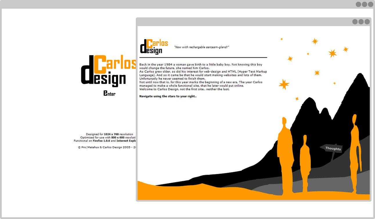
The art-direction is, kind of, okay I guess. But why I thought it was a good idea to have the entire website in a 800×600 popup I’ll never know.
If the previous website had a very excluding navigation, this one’s even worse. Because yes, of course you have to hover the little stars to navigate the website because God forbid I would have made it easy for people.
Apparently it’s, “Functional on Firefox 1.0.6.”
That’s adorable Past Carlos.
Adorable and stupid.
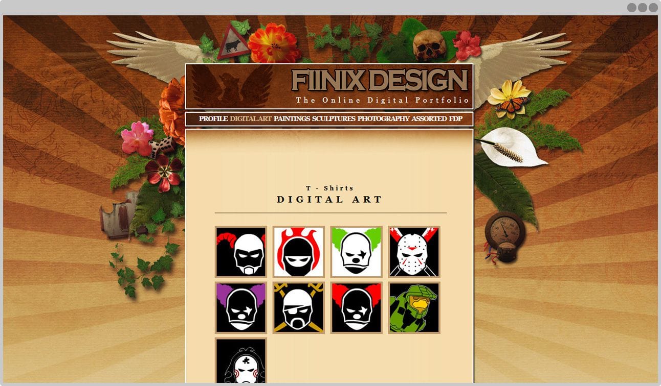
Despite having used Adobe Photoshop for years at this point I still thought it would be a good idea to throw everything into one big ass picture and use that as the header background.
No Flash navigation is sight which is good. Surprisingly content-focused with decent copy. Pictures open in a stupid Lightbox which was—and for many still is—all the rage.
The typography isn’t very thought out though and the kerning and horizontal centering on the headings seems unnecessary but at least we’re making progress.
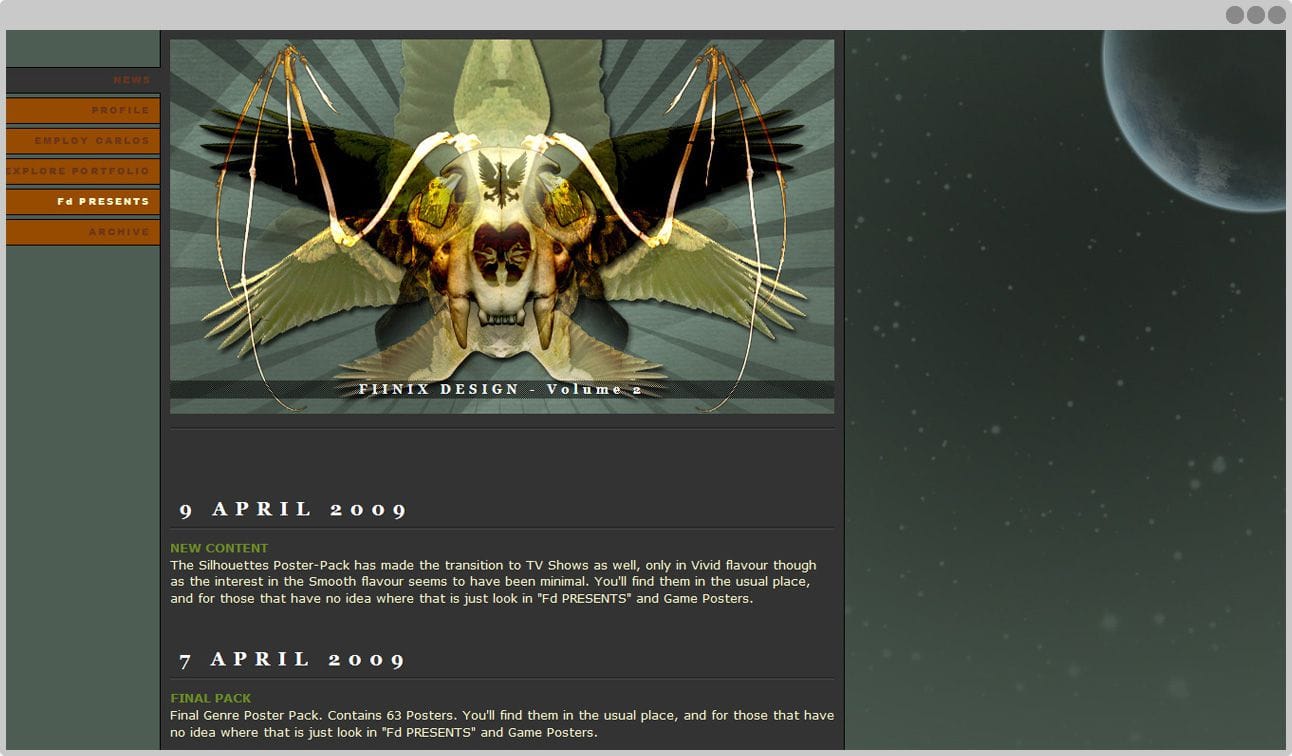
I’d like to say that Past Carlos is showing a little more constraint when it comes to using all the Effects in Adobe Photoshop but let’s not kid ourselves, because he isn’t.
The blog-type content makes its first appearance here and the homepage is solely dedicated to it.
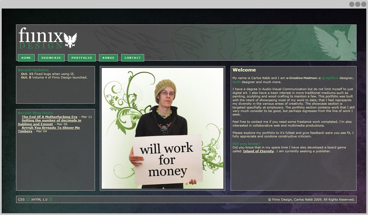
The font-sizes are still way too small—it takes another few years before I really begin to learn the importance of good typography.
But at least I learn some things and decide to retire things, as this is the last time we see the bird from Fiinix Design.
This was also the last time we have to see those ridiculous CSS and HTML validation buttons in the footer.
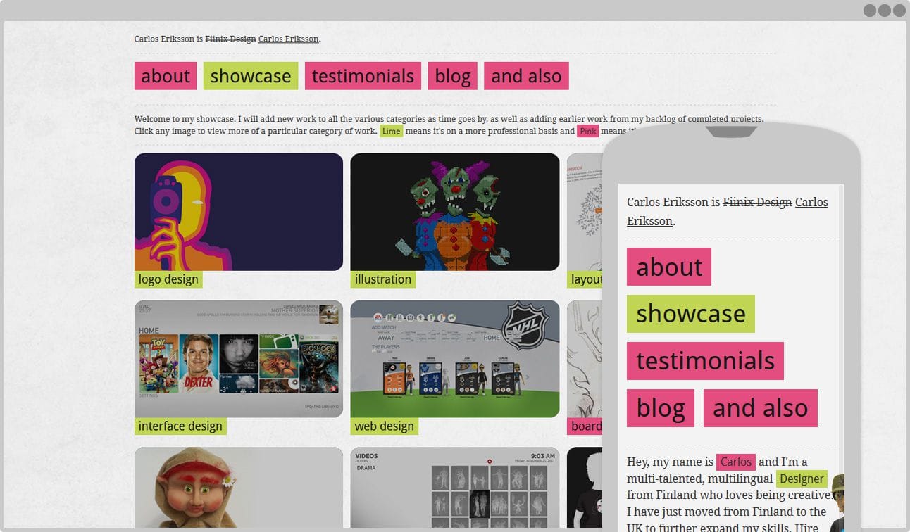
Back in 2010 Ethan Marcotte had already coined the term RWD but it hadn’t become the household name it is today.
Looking for jobs in the UK gave me the perfect excuse to redesign—again—my website and this time following the principles of RWD as I best understood them.
Moving to the UK also made me realise how difficult, “Fiinix Design,” was to write as I had to spell it out all the time and no one got it right anyway.
To be fair, Finnish people had trouble spelling it too so this wasn’t so much a new problem as one that I couldn’t avoid any more.
The time had come for the Fiinix moniker to retire and give way to Carlos Eriksson instead.
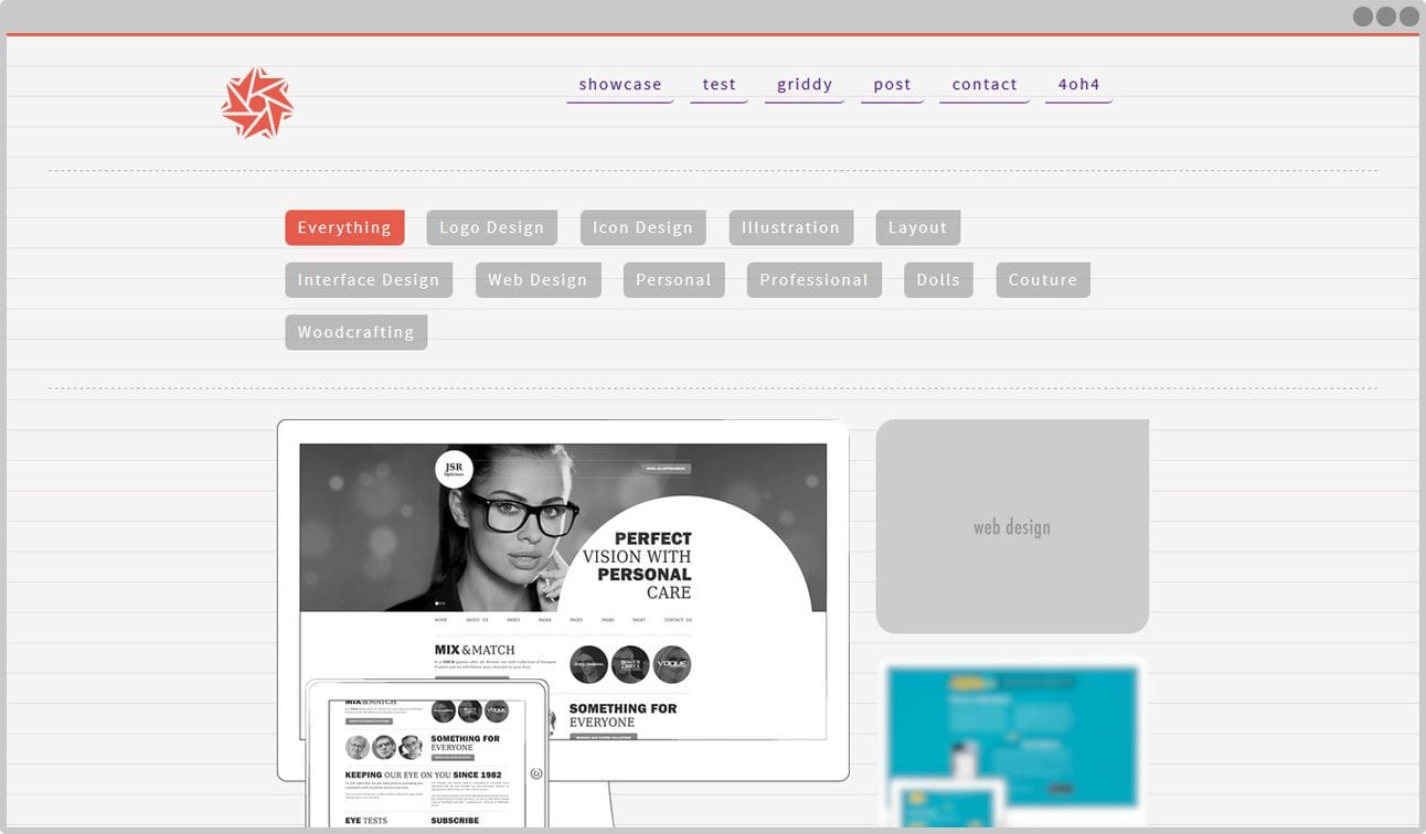
Understanding the importance of typography I got obsessed with vertical rhythm and having every line of text adhering to a strict baseline.
Unfortunately, you can’t have a strict baseline and headings with good line-heights (leadings). In the end, I gave up on this particular experiment and chose to let text sizes and readability dictate the line-heights for headings instead of forcing it to conform to divisions of the baseline—which always ended up looking disjointed.
Wanting to stay close to the colours of the previous version I took the Dark Pink and evolved it into a Flamingo Red, which didn’t end up staying anyway.
Which brings us to today
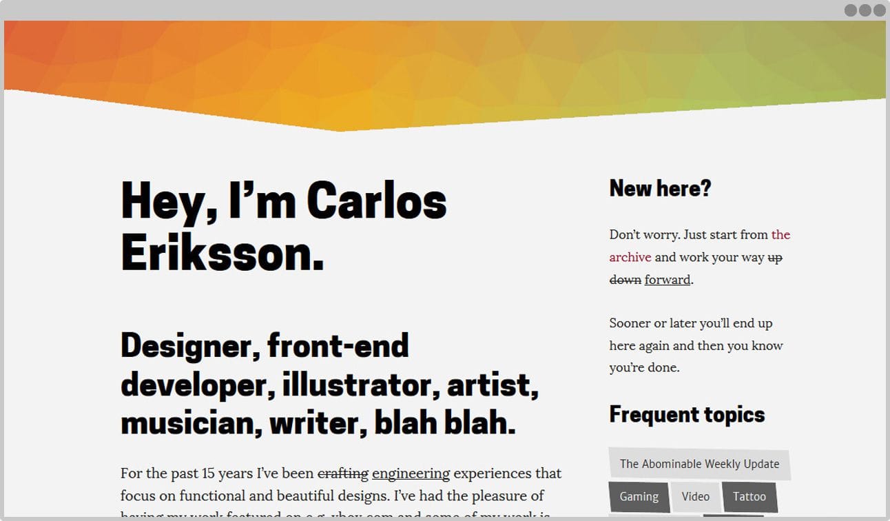
All these different versions is why, 589 days ago when I made the latest version of carloseriksson.com live, I wanted to try something a little different.
I wanted to try to iterate and build something out in the open, warts and all,
as Oliver Cromwell would have said.
So instead of designing something in secrecy to be revealed once it was done, I built something that barely worked.
But at least it’s live.
It’s where I can iterate and refine. Where I can make decisions based on either assumptions or data, or sometimes both. Where I can adjust ad infinitum.
As a website, it’s in its nature to never be done and I’m better of not fighting it.
But don’t mistake this willingness to air my proverbial dirty laundry for not focusing on details. I can spend countless evenings, getting lost in a sea of typographical tweaks, but not at the loss of getting something that works, live.
Which is what you’re looking at right now, another set of, “things that work.”
Other times I tried thing that didn’t work or, as in the case below, they worked perfectly fine from an aesthetic point of view but couldn’t justify their own existence in any other.
It’s at this point that we, of course, go back… to the future.
Back to the future
It’s been said that no one knows what the future brings. Or was it, “There’s no fate but what we make for ourselves”?
I get things confused sometimes.
Either way.
Before Google makes websites obsolete by harvesting all their valuable metadata for their own search results I can keep tinkering with carloseriksson.com.
This time, I’m looking at the work of Raúl M Rosarivo, Jan Tschichold, etc. and their canons of page construction.
The canons of page construction are a set of principles in the field of book design used to describe the ways that page proportions, margins and type areas (print spaces) of books are constructed. Canons of page construction, Wikipedia
But of course this isn’t print.
This is the web and we can’t apply the limitations of a fixed immutable medium to one that is flexible at its very core.
Or can we?
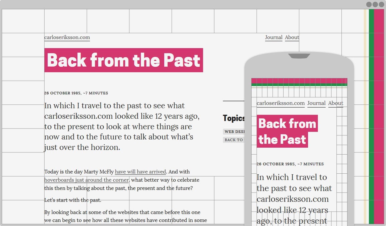
If the method and rules which has been developed for centuries, and have yet to be improved, can guide the production of perfect books then perhaps the same methods and rules can guide harmonious design for the web?
I want to find out. You’re welcome to join me.