Many years ago I worked on a council website.
I’ve had the privilege of rebuilding more than one council website throughout my career, but this was my first experience conducting user testing with people with disabilities and because of that, its memories have stayed with me.
As soon as we had a functional and representational prototype, we moved to the first round of user testing. Together with the Kent Association for the Blind we were working with blind and partially sighted people to test one of the client’s key features.
This is how I learned just how little I actually knew.
Or how little any of us know, when we’re not testing and working with people with real disabilities, in the comfort of their tools and preferences.
It’s where I first met Susan who was born severely sight impaired (blind) and uses a braille display to browse the web.
A refreshable braille display or braille terminal is an electro-mechanical device for displaying braille characters, usually by raising round-tipped pins through holes in a flat surface. Braille displays use screen readers to get the information they need.
Screen readers do the best they can with what they have.
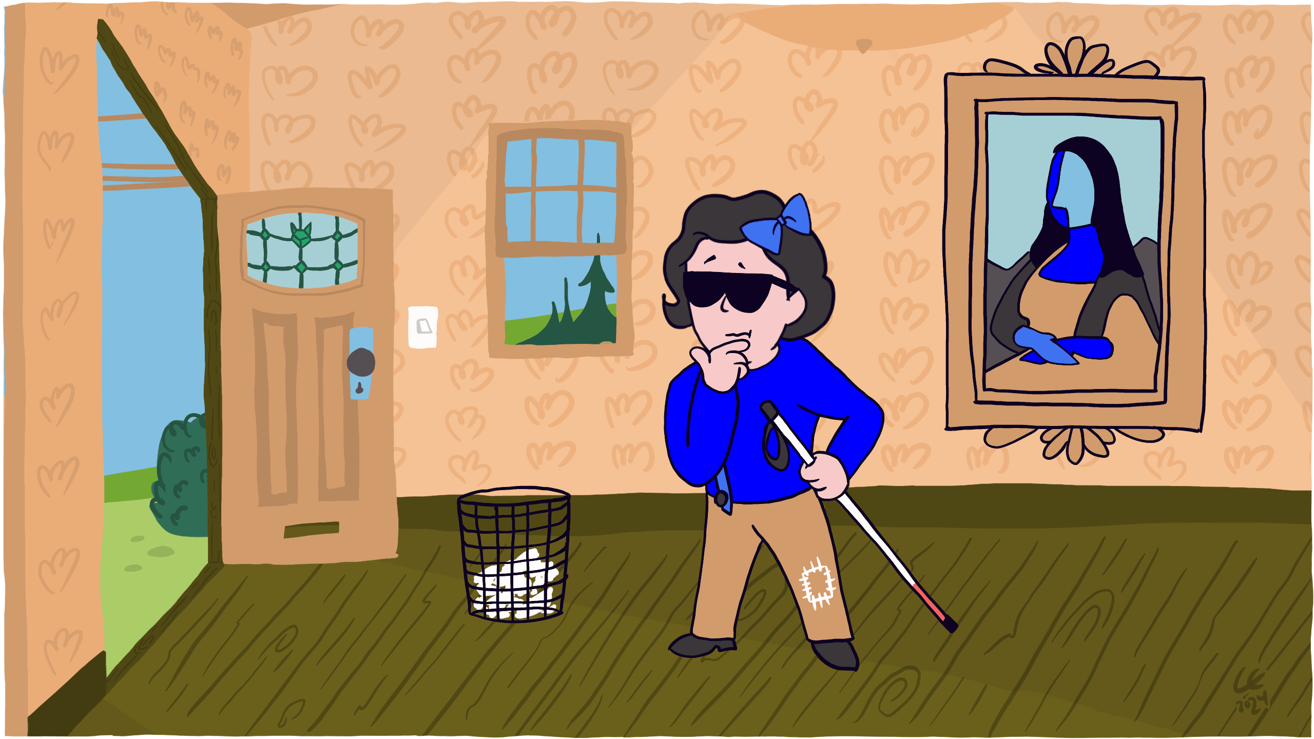
Because of this, Susan is often met with meaningless references to URLs for images, in the form of, “Image H T T P S colon forward slash forward slash W W W dot Louvre dot F R forward slash sites forward slash default forward slash files forward slash…,” and so, instead of their text descriptions.
Or links with mysterious destinations such as, “Click here, Link,” and, “Read more, Link”, which mean nothing to her.
And last but not least, forms fields without labels, giving her, “Edit, Has autocomplete, blank,” for every field she encounters.
And Susan, unfortunately, isn’t alone.
According to the World Health Organisation (WHO), about one in 200 people worldwide are blind.
At 36 million people, that’s more than the entire population of Peru.
But millions more have different degrees of vision impairments and whilst they’re not blind, they still use Assistive Technology (AT) to access the web and rely on meaningful text descriptions to understand the content.
Take action
There’s a few guidelines for designing with people who are blind but today we’re only focusing on this one:
Don’t show information in an image or video only, instead describe images and provide transcripts for video.
And specifically, the art of describing images.
What do we mean when we say, describe?
The technical name is, ‘alternative text,’ or ALT tag, as it’s often incorrectly referred to, but practically what it means is that it’s a text description which is used to provide information to people in an alternative way.
If the image can’t be displayed, for example it might fail to load or a visitor is using Assistive Technology (AT) such as a screen reader, its text description is used instead.
An image has no meaning without its context. The surrounding story creates the context, which in turn is what we use to help us write a good text description.
It’s the difference between being literal and writing, ‘I heart icon you,’ when we really mean, ‘I love you.’
Or, ‘we performed love surgery on him,’ when we should be saying, ‘we performed heart surgery on him.’
Context matters and the same text description in one context might be nonsense in another.
Unlike page content, the text description isn’t structured, so it has no headings and we can’t use markup.
We keep it to around 150 characters (not words) so that AT, such as JAWS, can read out all of it. Also, if it gets longer than that, should it really be an image at all?
The answer is often, no.
There are exceptions of course, moments when we don’t have to write a text description. When doing so would in fact do more harm than good. These are called decorative images and Web Accessibility Initiative (WAI) has a great Decision Tree to help determine if an image doesn’t add information to the content of a page, and therefore doesn’t need a text description.
Use Image Alt Tag Checker to scan your current website for missing text descriptions.
The results from our user testing with Susan and the Kent Association for the Blind taught us that nothing compares to testing and working with people with real disabilities.
And that we should always test our assumptions.
In the end, the council decided to go ahead with their key feature, despite the overwhelming evidence against it and its usability.
In hindsight I feel responsible and that I should have made a better case against their business decision.
We still have a lot of work to do towards including Susan, but describing images can go a long way.
Know someone who would benefit from this article? Share it with them.