A little girl is recovering from four years of battling cancer.
One day her cancer relapses and she needs to return to the hospital for chemotherapy.
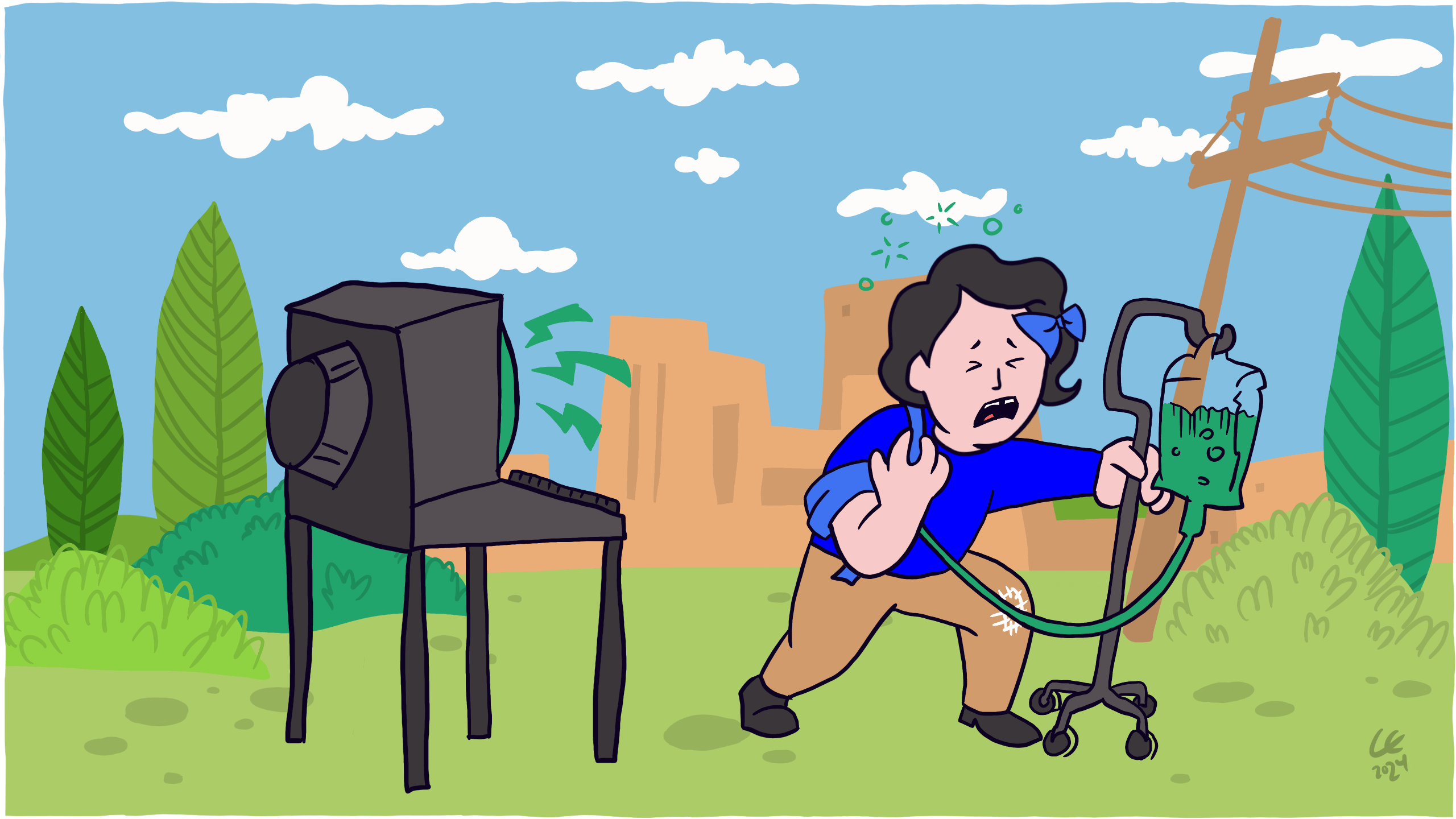
The chemotherapy treatment is so strong and toxic that anyone who is given it needs intravenous (IV) fluids for several days to prevent dehydration.
Because of this, the little girl has three nurses monitoring her throughout the treatment. But with too much information to keep track of, they need to rely on specialised software where they enter critical information.
The treatment is given.
And the software which should have been straightforward and simple is instead confusing and difficult to read. Violating many basic rules of usability the information is too dense, colours too attention-grabbing and critical information is lost.
The nurses are forced to spend more time deciphering how to use their tool than getting the information they need, causing them to miss the girl’s hydration levels.
Let’s pause for a second and walk through the chain of events that lead to this.
At one point in history, a nurse realises that the amount of information that needs to be tracked is too much for any pen, paper and person.
A problem is born.
That problem is brought to someone’s attention, someone who thinks it’s worth solving. Budgets are signed off.
Meanwhile, somewhere else, a company named Epic Systems decides to build an electronic medical record software application.
Someone researches the problems medical staff often face. Sometimes when we do that we talk to those people, though often not.
Someone else decides what information is important and needs to be shown. But in doing so, also makes decisions on what information is unimportant and should be hidden. We usually call this Information Architecture (IA).
Someone else decides where that data should be displayed in the treatment software’s user interface (UI). We often think of this step as design. But in reality, design is every step from intention down to execution.
Someone else receives the visual design. Even though it’s static and only represents a fraction of the states the software can be in, we often build it by estimating the in-between.
Someone else tests the application by running through a set of checklists, usually representing the ideal user flow.
Someone else signs it off.
Meanwhile, with the budget signed off, someone sends a request for quotation (RFQ).
Someone talks to someone else until a set of requirements are met and the application is delivered.
Where did it go wrong?
Now, everyone who contributed to it was important.
No single person can or should do all of these steps on their own, we and our work are better together.
Besides, who do we blame in a chain that fails, when every link is broken?
No one? Everyone?
Along the way, anyone could have stopped and asked, “What if?”
What if they are colour-blind and can’t see the warning colours?
What if the information is too packed and difficult to read?
What if they don’t notice the hydration levels?
But no one did.
The experienced nurses missed the dehydration alerts because they were too distracted trying to understand the bad design of the software they had to rely on.
As a result, the following morning, the little girl is dead.
At its worst, bad design sends an Ebola patient home, ignores a pedestrian and runs them over, causes a pilot to crash their plane, kills its patients with radiation and many more lethal consequences.
At its worst, bad design kills.
At its best, good design saves lives.
The lesson here isn’t easy but ignoring it has terrible consequences.
It’s our duty to make design for good, to make things easier, not worse.
We have a responsibility to ask the difficult, “What if?” questions.
Our lives depend on it.
Know someone who would benefit from this article? Share it with them.