Previously, on carloseriksson.com, the body face was set in Lora, with Cooper Hewitt for display face. Both font families were subset to improve performance.
We’ll start with the body text because 99% of my—and most other people’s—writing is body text after all.
My stories need to be accessible, readable, usable, scalable, citable and sendable before anything else.
Figuring out the body text
As much as I love Georgia, let’s compare it to Lora to remind ourselves what it used to be like before the reboot.
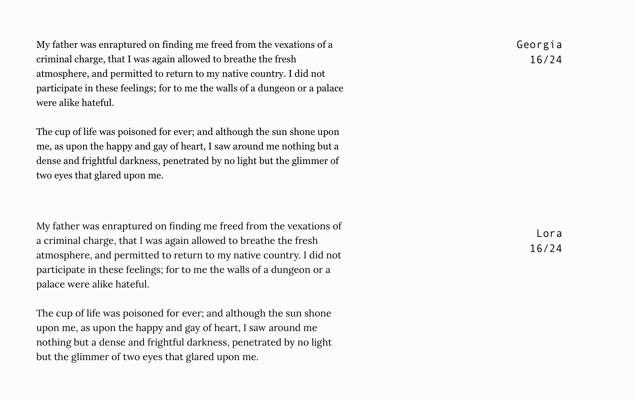
Okay, So right away I prefer Lora, designed by Olga Karpushina, because it’s got a certain story-telling mood to it and that’s something I want.
But I’m not sure about using Lora specifically.
In the spirit of story-telling let’s look at a classic, a true timeless typeface based on Italian Renaissance typography and with centuries under its belt already.
As I’m sure you’ve guessed it already, I’m of course talking about that famous humanist old-style serif typeface from the mid-16th century.
It’s Garamond.
I’m not even kidding, by the way, I fucking love Garamond.
Well, this is a contemporary version of it anyway, in the form of, EB Garamond, the digitization based on the Berner specimen from 1592.
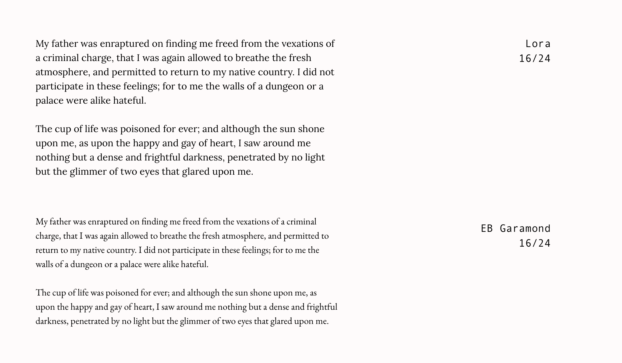
I like the mood, I prefer this when compared to Lora so we’re on the right track.
The x-height is too low though.
A problem with Lora and EB Garamond however, is that they’re both web fonts, which will impact page performance.
My performance budget for the reboot, whereby a person will have to wait 2.4 seconds before they can perceive and interact with my website, means I only have 20 KB available for fonts.
Lora (Regular, Bold and Italic) in WOFF2, when subset to Latin character sets, still weighs in at 79 KB.
Meanwhile, EB Garamond (Regular, Bold and Italic) in WOFF2, when subset to Latin character sets, weighs in at 95 KB.
WOFF2, a TrueType/OpenType font that provides better compression than WOFF 1.0, is supported across all modern browsers, and with a sensible font-stack, I’ll serve something else for those browsers that don’t support WOFF2.
However, neither of these particular fonts are going to work.
What if I could have something similar to EB Garamond but with a higher x-height and smaller request size?
So we turn to another favourite old-style serif typeface based on Italian Renaissance typography—you guessed it—Palatino.
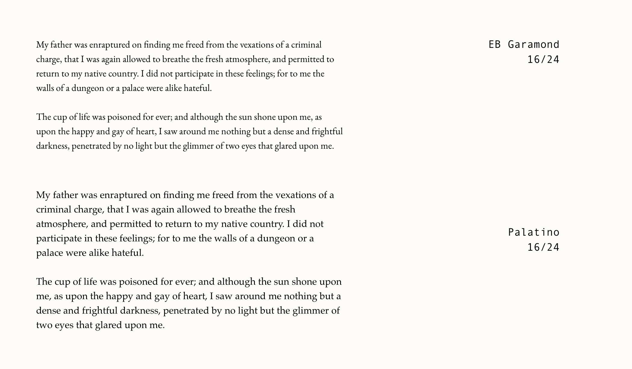
Ooo, look at it. It’s lovely, isn’t it?
Designed by Hermann Zapf in 1949, it was never intended as a book type but a commercial face. Its popularity as a book type, however, means it’s gone through many contemporary adaptations over the years.
It bridges one of the most transitional periods in all of the history of typography and printing; spanning the age of metal type, photo lettering and then digital.
I think we have might have a winner, but before we move on, let’s take a closer look and compare them all together to be sure.
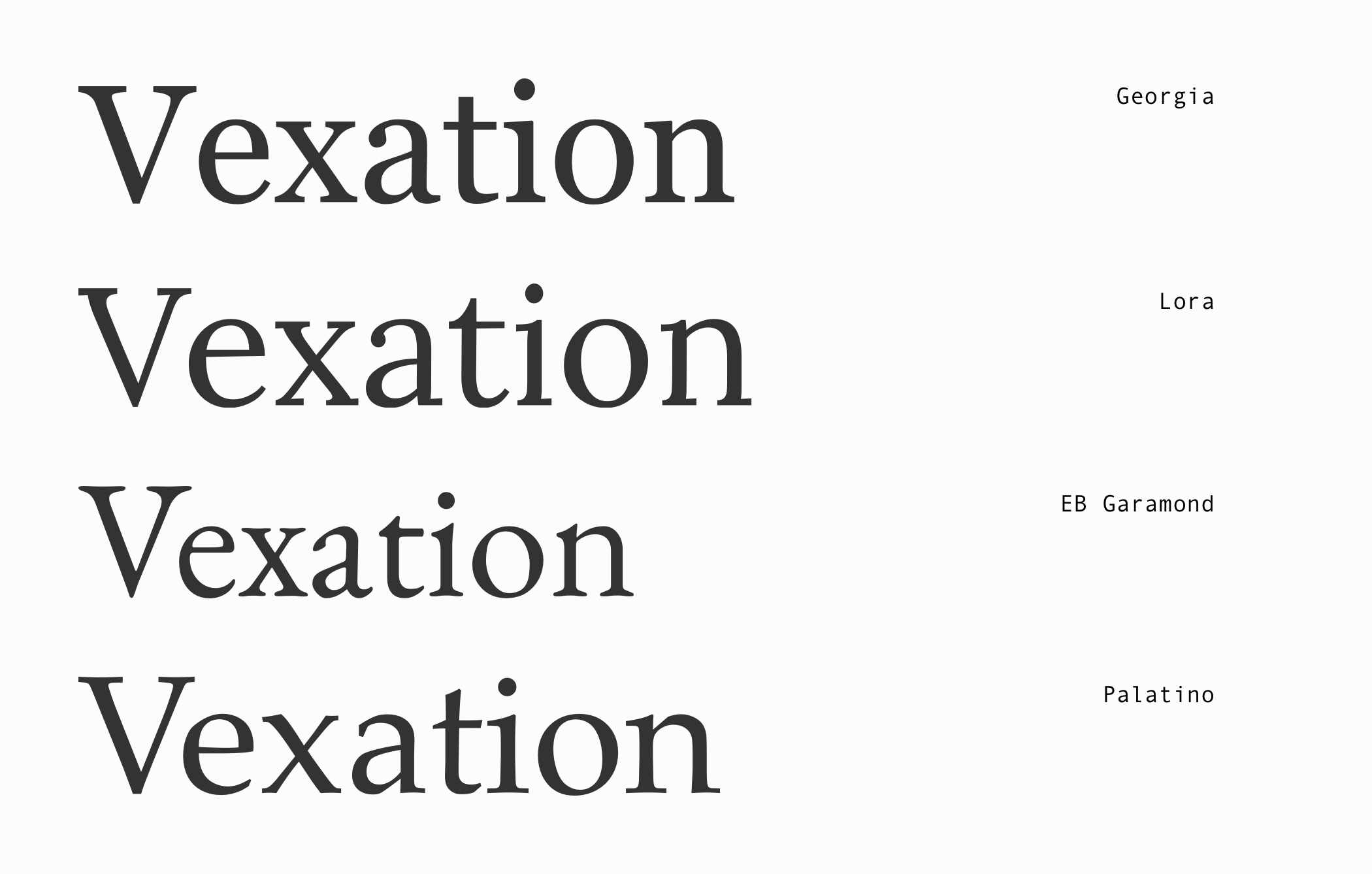
Yes, I’m liking Palatino, it’s got the right vibe.
Which effectively gives me this:
font-family: "Palatino", serif;
As far as font stacks go, however, it’s not very stack-ey.
Because I’m not relying on web fonts, anyone who doesn’t have Palatino will be faced with the system serif and whilst that’s mostly fine, I’d like to influence the direction a little more where possible.
At least I don’t have to worry about WOFF2.
This is the point where I go down a rabbit hole of discovering the history of Palatino, its many controversies and clones, and the somewhat ambiguous concept of intellectual property in type design.
A rabbit hole later
When I emerge from the rabbit hole, days have passed and I have a collection of Palatino-esque typefaces.
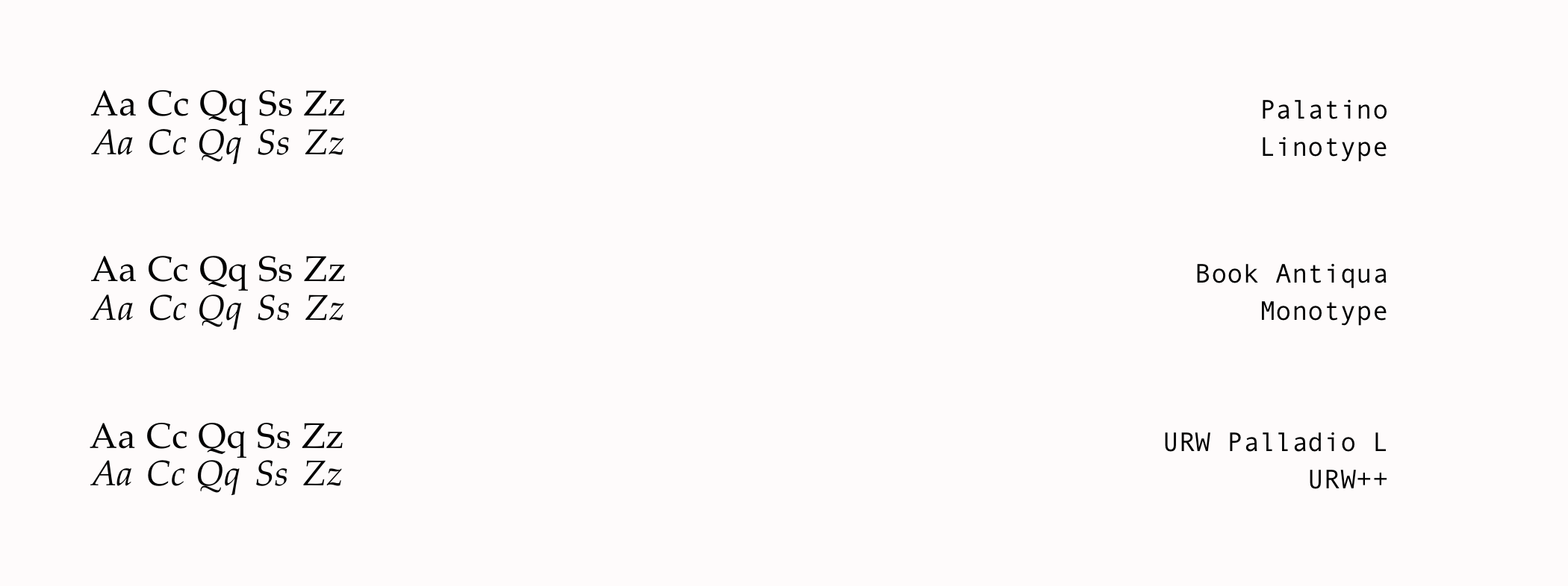
As you can see I’m even including the controversial Book Antiqua from Monotype—gasp!
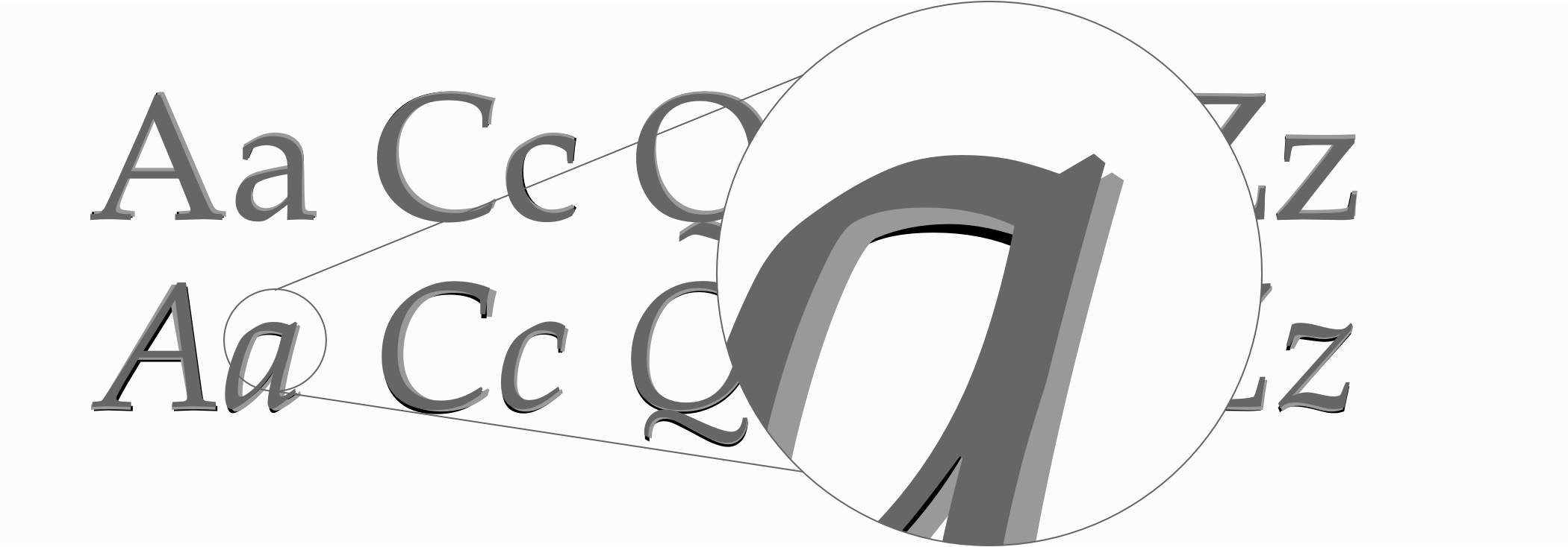
If we take a closer look you can see how similar the letter shapes are and at body text sizes few people will be able to distinguish between the different copies.
And with my body stack looking at a lot better too, we can move on to the display face.
font-family: "Palatino Linotype", Palatino, Palladio, "URW Palladio L", "Book Antiqua", "Zapf Calligraphic 801", "PalazzoOriginal", Baskerville, "Bitstream Charter", Garamond, "New Century Schoolbook", "Century Schoolbook", "Century Schoolbook L", Georgia, serif;
Because typography isn’t only about establishing a mood and picking a typeface, it’s also deciding on sizes, tracking, kerning, leading, measure, and space between paragraphs, things are going to start looking a little odd until I’ve gone through all of them.