I’ve used Cooper Hewitt as my display face since May 2018 and I think it still serves me well, provided I serve it myself.
So my starting point is that I want to keep it if I can—performance budget and the other goals permitting—but I’ll explore some options anyway because who knows, I might change my mind, I’m fickle like that.
To make it accessible, readable, usable, scalable, citable and sendable, all heading levels need to be used sequentially to inform the document’s outline, so no jumping from an H1 to an H3.
And no wrapping individual letters in <span> elements to get fancy effects—screen readers will read out letters individually, which is user-hostile.
First, let’s remind ourselves what it used to be like before the reboot.
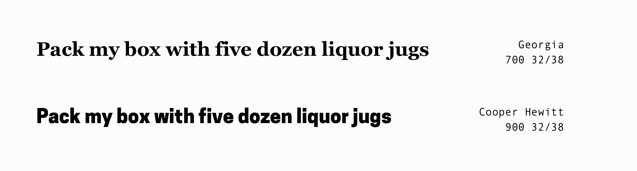
Almost seems unfair to compare, doesn’t it?
Actually, comparing a serif inspired by 19th century Scotch Romans, designed for legibility at small print or low-resolution displays… to a geometric sans serif, with modified-geometric curves and arches, is unfair.
So, let’s normalise the weight from Heavy (900) to Bold (700) and compare it to some other geometric sans-serifs instead to make this a more fair match.
For this reboot, I’m judging them in both in tone and style, against the intention of creating a living document of my multitudes.
Within the constraints I’ve already outlined—many of which will be down to the technical implementation—my judgement will mostly be based on vaguely defined gut-feelings—but I’m going to try my best to define them.
The contenders are:
Gotham, designed by Tobias Frere-Jones with Jesse Ragan. You might have seen it in Barack Obama’s 2008 presidential campaign.
DIN 1451, its origins can be traced back to the Prussian railway in 1905. You might have seen it on a German Autobahn (motorway) system.
Futura, designed by Paul Renner in 1927 as a contribution to the affordable public housing project, New Frankfurt. You might have seen it at IKEA (until 2010).
Full disclaimer, I’m heavily biased towards Gotham, I fucking love it.
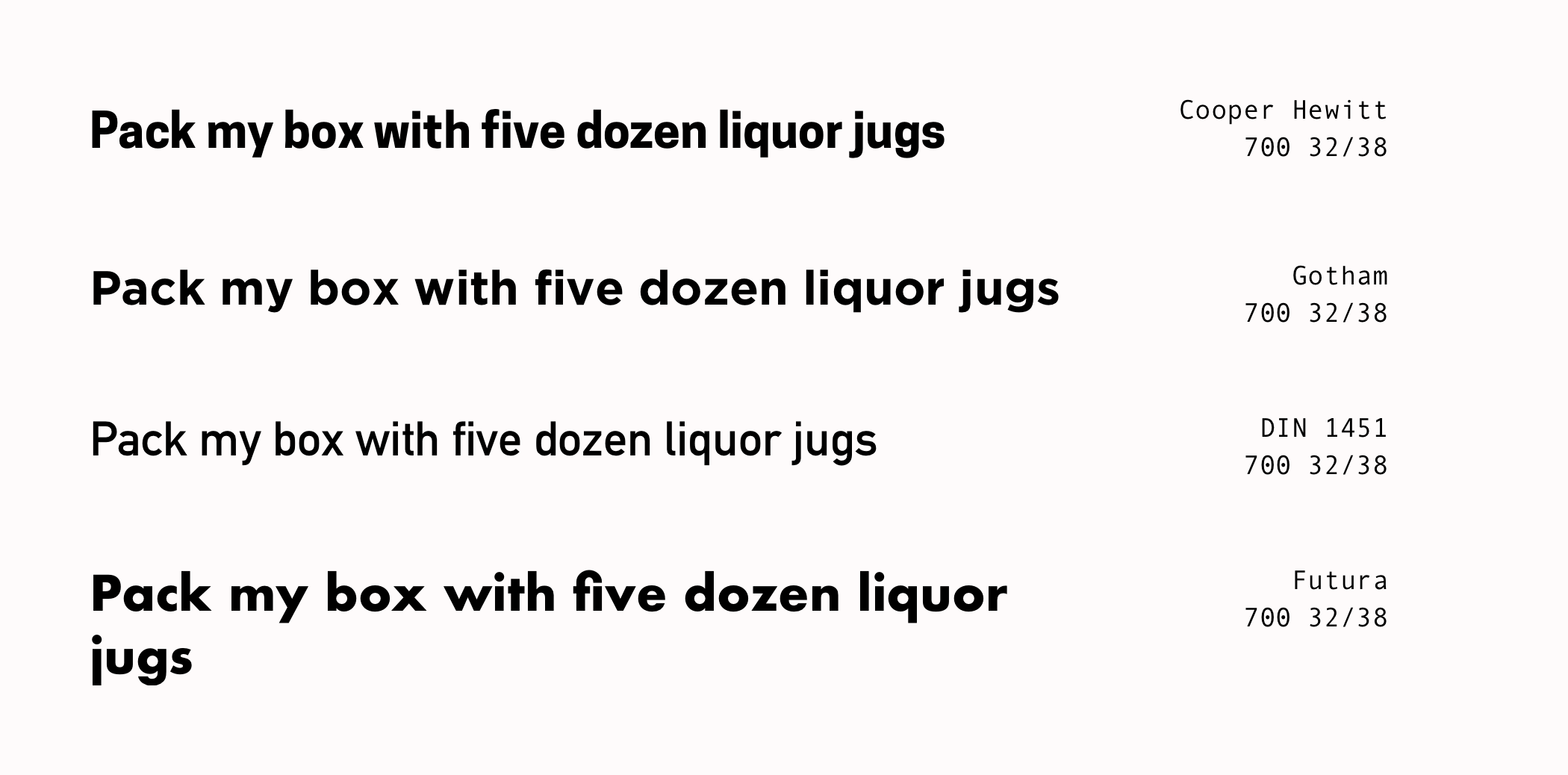
Gotham: Very nice. Lovely ascender on the lowercase “y”. The letter shapes are bit too wide though.
DIN 1451: Lowercase “t” is too narrow. Lacks personality.
Futura: Too geometric, letter shapes are too similar.
Whilst these contenders are all nice in their own right, I still prefer Cooper Hewitt.
From a letter shape point-of-view, I think it helps it a lot that, the designer, Chester Jenkins took the—back then unreleased—semi-condensed version of his Galaxie Polaris and used its form as a rough guide to draw everything from scratch.
On narrow viewports, this means I’ll be able to fit more characters into a single line.
From metanarrative point-of-view, it’s a typeface commissioned by and for a design museum, who wanted their custom typeface to be open-sourced. Conceptually, it’s a perfect fit.
Hold up!
Page performance and fonts
Before I get too excited, does it fit my 20 kilobytes (KB) performance budget?
Cooper Hewitt, with its 7,800+ characters, supports 36 languages and comes in seven different weights so I have a decent selection for once I’ve figured out the type scale. At which point I’ll review which weight(s) works the best.
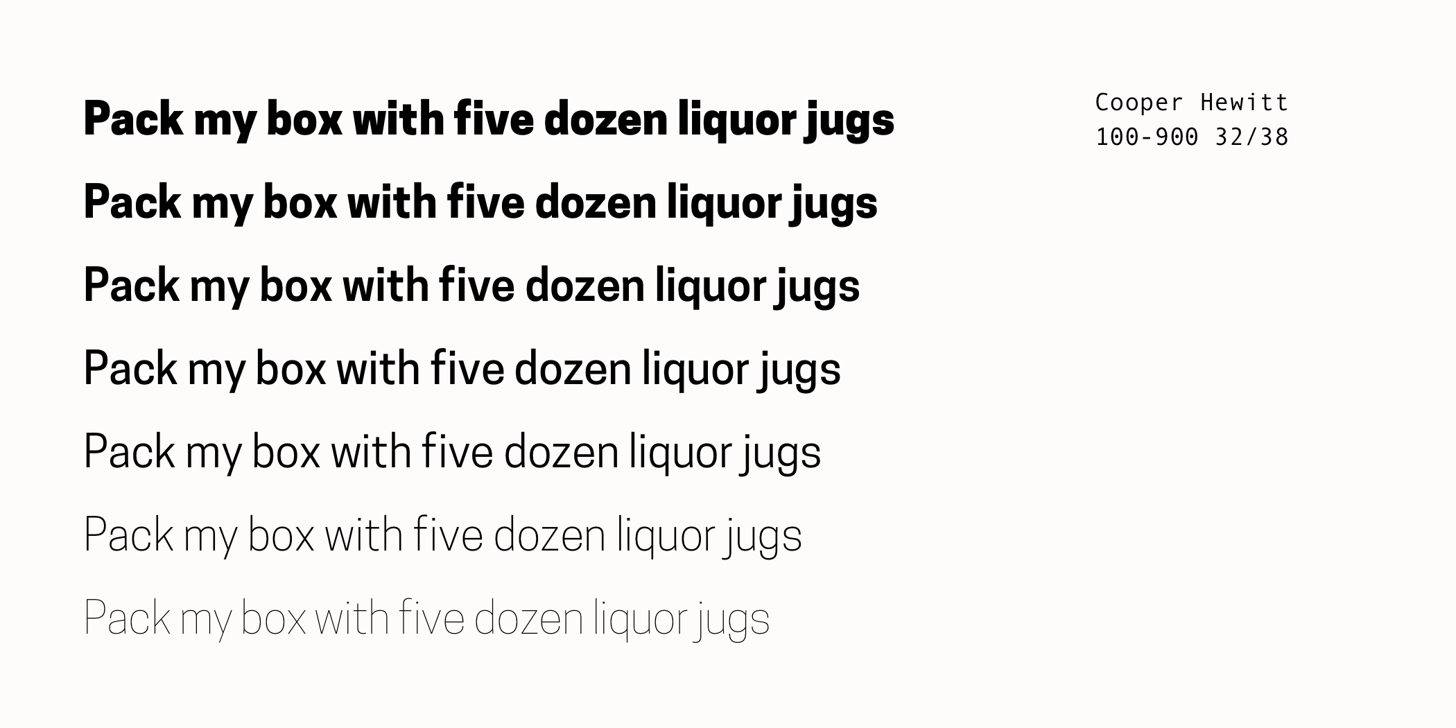
But, for now, to see if Cooper Hewitt fits into my budget, we’ll just use the Bold (700) weight—which represents a realistic scenario.
As is, in WOFF, the Bold weighs in at 54 KB.
Converting it to my preferred WOFF2 drops it to 39 KB, which is an improvement but not enough to fit into my budget.
WOFF2 + Subsetting it to only the Latin characters will limit how I can use but my writing is 95% in English that should be okay. This gets us down to exactly 20 KB, which could be enough but I’m not liking the non-existent margin of error this has.
Taking a moment to think, I decide to parse every title of my writing for the past 10 years. This gets me a list of 92 characters.
WOFF2 + Subsetting to only the 92 characters gets us down to 12 KB for a single weight.
| Format | Characters | Supported languages | File size |
|---|---|---|---|
| woff | 556 | 36 | 54 KB |
| woff2 | 556 | 36 | 39 KB |
| woff2, Latin only | 234 | 22 | 20 KB |
| woff2, Custom set | 92 | n/a | 12 KB |
That’s better. Now I have a margin of error and a good indication that I might be able to use Cooper Hewitt as my display face, though I will need to be vigilant about its file size and how I use it.
I’m not implementing this one just yet as I’ll need to review which weights are suitable for the sizes I decide. And I’ll need a fallback stack and font loading strategy—surprise! It’s another strategy.
Moving on to the type scale.