Just like when choosing a typeface, my work on the type scale (font-sizes) will start with the body text because 99% of my writing is body text.
And again, before anything else, let’s take a look at what the font-sizes used to be like before the reboot.
This will serve two purposes, 1) I get to critique my past work, 2) I get to critique our industry.
At one point during the previous design (May, 2018) I decided to experiment with responsive typography. So rather than having one type scale, I had two, and let the browser interpolate between them based on the viewport width.
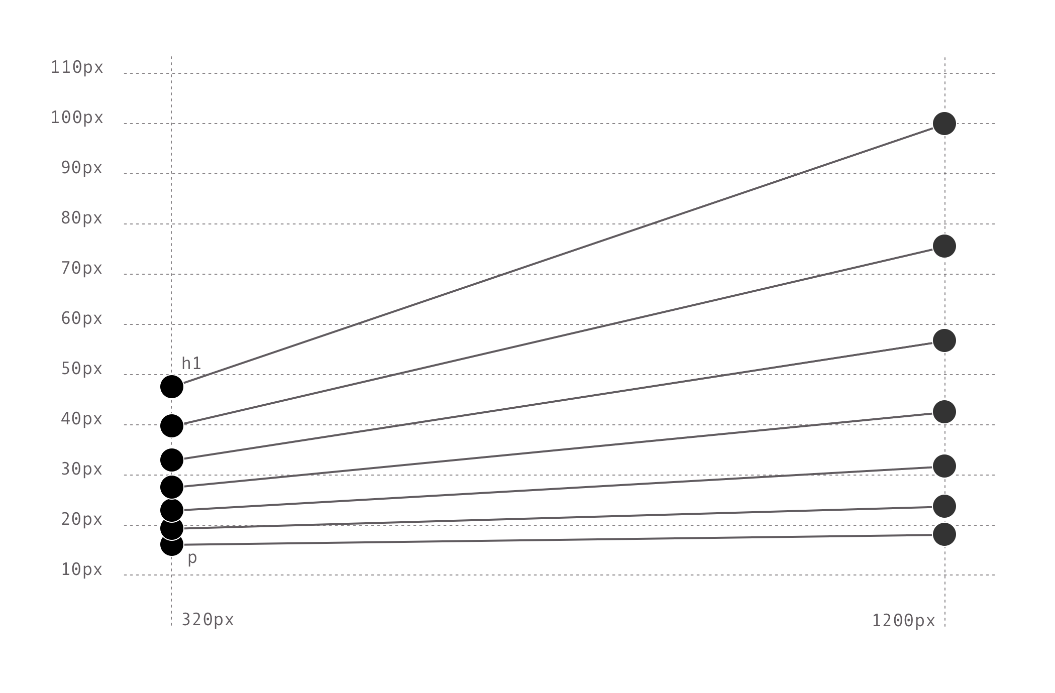
This meant, my font-size declarations were all like this, here showing the biggest size:
h1 {
    font-size: calc( 47.775744px + (100.9841935 - 47.775744) * ( (100vw - 320px) / ( 1200 - 320) ));
    }
As you can tell from my use of all the decimals, this approach puts more emphasis on the mathematics of the type scale and trusting the browser to calculate these values.
The result of which is a font-size that scales from ~47px to ~100px as the viewport increases from 320px to 1200px.
It has its benefits, but as Adrian Roselli demonstrates in Responsive Type and Zoom, responsive typography can be shit for some people because it breaks their ability to zoom the text.
In my limited testing of this particularly convoluted approach, both zoom and text size preferences did work, but there’s probably technology combinations I haven’t considered or tested.
Point is: I should respect your zoom or text size preferences over mine.
Setting that concern aside for a brief moment though, there’s something else which has always bothered me with this responsive typography approach.
Legibility and readability isn’t actually dependant on viewport size, sure, it’s a consideration, but what matters much more is the relationship between size and reading distance.
In a dynamic medium, such as the web, reading distance ought to dictate the size of the text.
But the technology for reading-distance sizing is immature and although there are some interesting demos1, in many ways, the browsers’ text size preference acts as a user-controlled reading distance anyway.
Which means, for the reboot, I’m thinking of going back to basics. And then letting, you, the reader decide, without my interference.
My art direction shouldn’t make your life harder.
Life is hard enough.
Embracing the browser defaults
So, we know what it was like before, now let’s look at what happens when I do nothing because there’s nothing more basic than that.
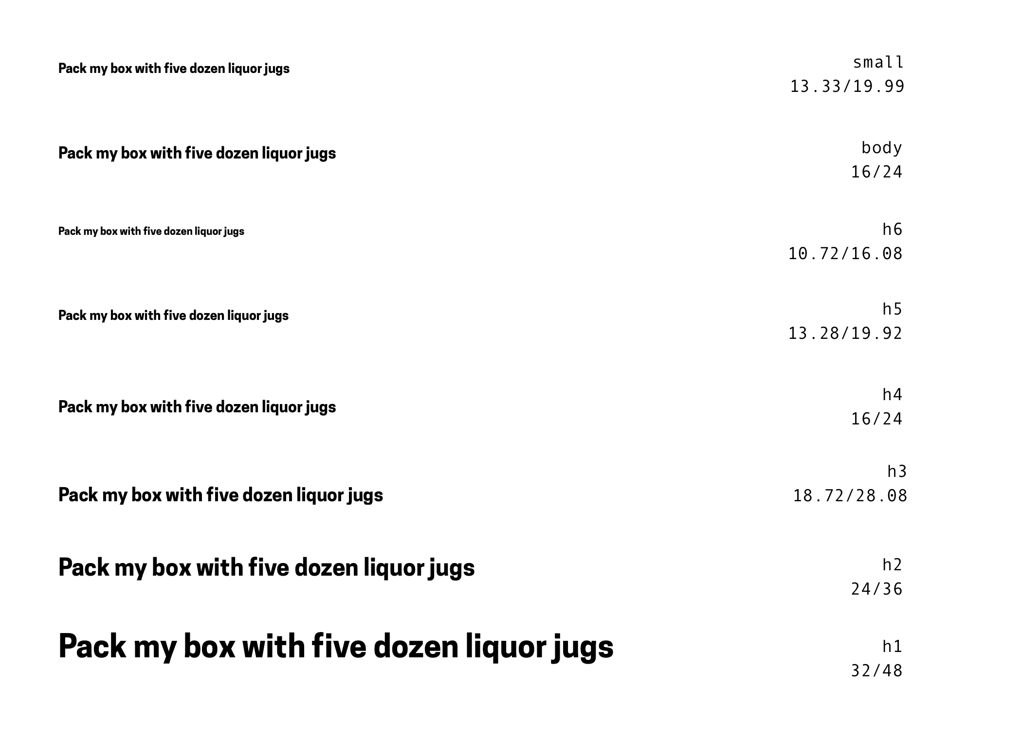
Right, so the default sizes are serviceable but I don’t like their hierarchy.
Headings are how we tell the browser what structure a page has.
From h1 to h6, what they all have in common is that they always precede the paragraphs to which they belong. You would never, and should never, put a heading after the paragraphs it belongs to.
Unless you’re a time-traveller and insist that your non-chronological reports should reflect that, in which case, as you were have will have been.
Now, Size isn’t the only way to describe hierarchical relationships but I do wonder, “Why are some of the headings smaller than the paragraphs they are meant to precede?”
This is the point where I go down a rabbit hole of discovering the original proposal for Information Management by Sir Tim Berners-Lee.
Why are some headings smaller than their texts?
Okay, so h4, h5, and h6 headings are smaller than their paragraphs because although all heading tags were part of the very first browser (WorldWideWeb, Dec 1990), they were completely unstyled.
By the time WorldWideWeb was renamed to Nexus, all headings were styled distinctly using a combination of some sizes, indentations, weights, and slants.
However, not every heading had its own size and to understand why, I think we need to go back even further.
Hypertext Markup Language (HTML) is based on Standard Generalized Mark-up Language (SMGL, 1974).
Meanwhile, SGML is based on IBM Generalized Markup Language (GML, 1969).
GML (by Charles Goldfarb, Edward Mosher and Raymond Lorie) was born out of the need for a markup language while working on a rudimentary document management system intended for law firms. These tags, called the GML Starter Set References, became the main component of IBM’s Document Composition Facility (DCF).
Although the laser printer at the time, the IBM 3800 Printing Subsystem, supported a few different typefaces, it only had one font-size, so they used spacing, underlines, and capitalisation to style their headings—back then called head-levels2.
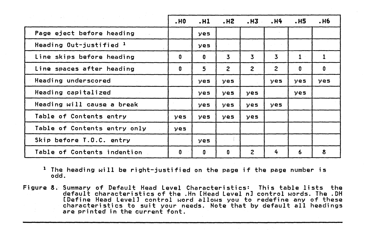
The release of the third edition, now called IBM’s Document Composition Facility Generalized Markup Language Implementation Guide (March 1985)3, is the earliest reference to font-sizes I can find.
Following in the footsteps of its predecessors though, it still relies on a combination of sizes, weights, and slants to distinguish hierarchy.
And this is where I think we have our answer and a lesson; Unless we’re careful, tomorrow’s technology is built on today’s understanding of yesterday’s paradigms, whether they apply or not.
But then again, Sir Berners-Lee’s focus was on the hypertext paradigm, not headings.
Several levels (at least six) of heading are supported. Note that a hypertext document tends to need less levels of heading than a normal document whose only structure is given by the nesting of headings. HTML Tags, Sir Tim Berners-Lee
After Nexus, other browser vendors soon showed up; ViolaWWW (March 1992), NCSA Mosaic (Jan 1993), Netscape Navigator (Dec 1994) and Internet Explorer (Aug 1995), all with their own ideas for what ought to be supported and how.
NCSA Mosaic, for example, introduced the controversial IMG tag to support images despite protests.
By the time HTML as an actual standard was defined (Nov 1995)4 and with no heading sizes in sight, it was a bit too late.
Despite an effort to reel things back into some coherence, back then, the newly formed World Wide Web Consortium (W3C, Oct 1994) was busy describing what current browsers were already doing, rather than telling them what they ought to do.
Once we get the first recommendation for Cascading Style Sheets (CSS)5 (Dec 1996) it still only mentions what sizes h1, h2, and h3 should be.
H1 { font-size: xx-large }
H2 { font-size: x-large }
H3 { font-size: large }
Earlier that year, Internet Explorer 3 (Aug 1996) was the first commercial browser that supported CSS (though only partially so), but because it was released months before the recommendation became a recommendation, the developers for IE3 used its predecessor as a reference.
Which used its predecessors.
And so on, all the way back to Charles F. Goldfarb’s work on GML at IBM back in 1969.
Unless we’re careful, tomorrow’s technology is built on today’s understanding of yesterday’s paradigms, whether they apply or not.
Fast forward to today and the current CSS Candidate Recommendation6 now specifies the font-sizes for all heading levels but h4, h5, and h6 are still defined as fractions of the medium size, making paragraphs and h4 equals in hierarchy.
| CSS absolute-size values | xx-small | x-small | small | medium | large | x-large | xx-large | |
|---|---|---|---|---|---|---|---|---|
| scaling factor | 3/5 | 3/4 | 8/9 | 1 | 6/5 | 3/2 | 2/1 | 3/1 |
| HTML headings | h6 | h5 | h4 | h3 | h2 | h1 | ||
| HTML font sizes | 1 | 2 | 3 | 4 | 5 | 6 | 7 |
Rejecting the browser defaults
Having answered my original question of why, I can now ask the inevitable follow-up, “Should some headings be smaller than the paragraphs they precede?”
My opinion is, “No, they shouldn’t.”
All other things being equal, that is, a text with headings and paragraphs where the property values are the same, size is by far the easiest property to distinguish visually for the most number of people, within the restrictions of our medium.
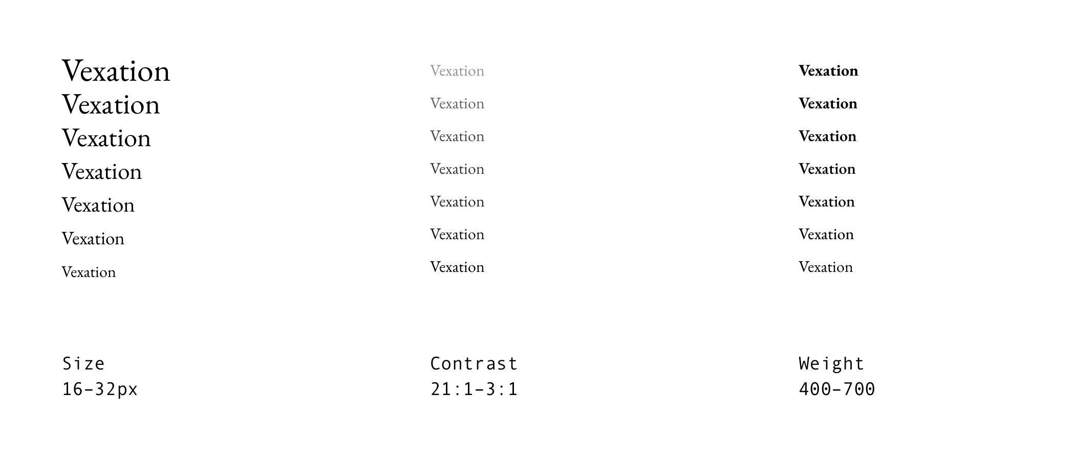
Size is the most meaningful property for hierarchy. Any h6 heading is always of a higher hierarchy to its text, therefore I think any h6 ought to be bigger than its text.
That, in turn, means h5 should be bigger than h6, etc.
So I slightly disagree with the W3C standards, which recommends that h4 and body text are the same sizes.
That is a long fucking journey from, “default sizes are serviceable but I don’t like their hierarchy.”
So, what does it all mean?
It means, I apparently have a lot of opinions about typography but I’m finally ready to start designing my type scale.
This is where my opinions about the Standard, misinformed as they probably are, may take a step back for personal preferences. After all, this is my website.
Or in the words of Rage Against the Machine, “Fuck you, I won’t do what you tell me,” where I play both the part of “You” and “Me”.
The default font size of 16px feels too small so I bump it up to 18px. My eyes start to relax a little bit. I keep going up until the strain on my eyes stops.
21px, yeah, that looks like a good start.
In the next entry, maybe I’ll actually get around to the type scale itself.
IBM Document Composition Facility User’s Guide, First Edition, July 1978 (PDF, 21MB) ↩
IBM Document Composition Facility Generalized Markup Language Implementation Guide, Third Edition, March 1985 (PDF, 15MB) ↩
Hypertext Markup Language - 2.0, RFC 1866, Headings: H1 … H6 ↩
Cascading Style Sheets, level 1 Recommendation (now superseded) ↩