Note: Even though I slightly disagree with the W3C’s Standard, what I do here is not what I think the Standard ought to be.
Continuing where I left off, I have just decided that 21px seems like a good size for the body text.
That becomes my baseline from which all other sizes stem.
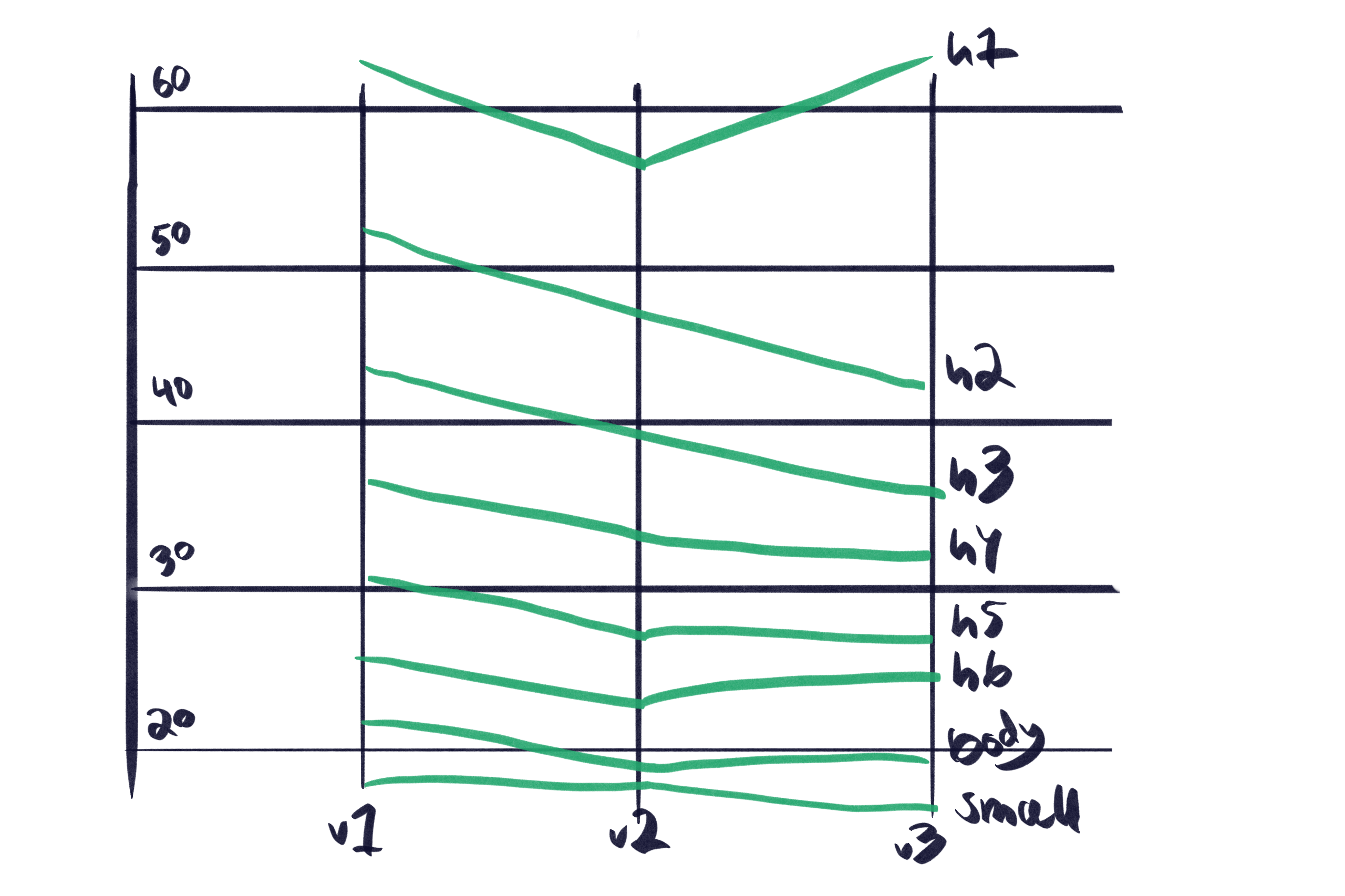
I quickly make a hierarchy by scaling the baseline by a factor of 1.2, which gives me the following sizes (in pixels, rounded to one decimal):
v1: 17.5, 21, 25.2, 30.2, 36.3, 43.5, 52.3, and 62.7.
This way I can test the hierarchy on my phone and realise the baseline doesn’t work, 21px is too big.
When I say test, what I really mean is, “looking at it and its measure, and deciding if it’s comfortable to read.”
The body text size will need to work well enough where the measure and width are restricted by form factor and where I’m restricting it for readability. Without changing its size, since I’m not using fluid sizes.
So I decrease it to 20px, run the same tests and then finally to 19px before reaching a size which isn’t awful in either scenario.
I now have these sizes (in pixels, rounded to one decimal):
v2: 17.5, 19, 22.8, 27.4, 32.8, 39.4, 47.3, and 56.7.
And this is what I think good tools are good for, allowing us to move faster where it’s safe and sensible to do so.
I then take this scale and start tweaking it manually for a couple of reasons; 1) to introduce imperfections and, 2) to increase the title size beyond the scale.
I keep going until I end up with this (in pixels):
v3: 16, 19, 24, 27, 32, 36, 42, 63.
The aesthetics I’m going for can best be described as, “Inspired by the Finnish archipelagic landscape,” or, “chunky digital Birch tree.”
Heading weights
The Heavy (900) weight of Cooper Hewitt I’m using is lovely and works well for Titles but not for in-content subheadings, where the size and letter thickness makes them too packed together.
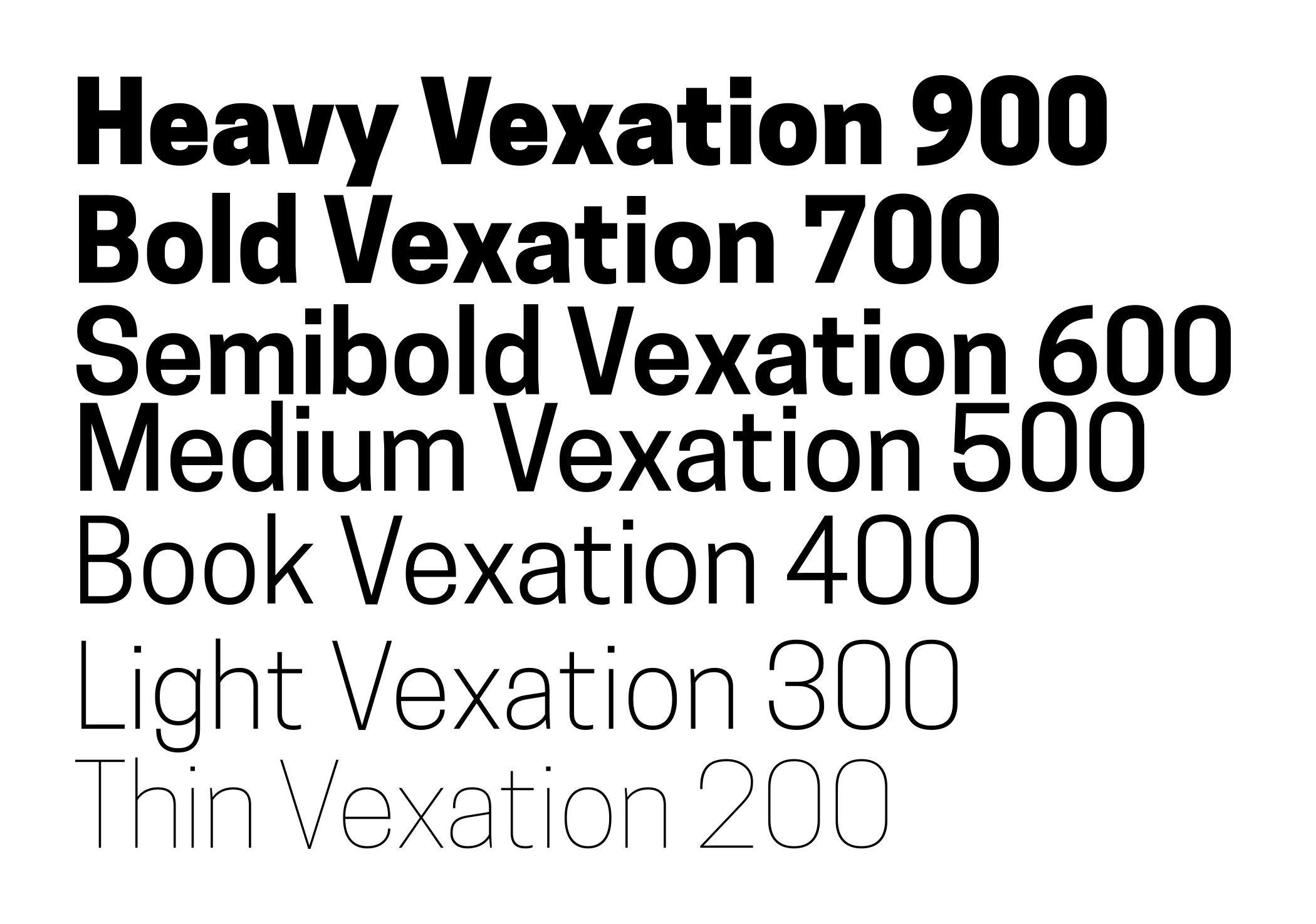
I introduce a second weight, Semibold (600) but it’s still too thick.
Changing it to Medium (500), the subheadings go from, “Meh,” to, “Mwah!” and I know I’ve found my weights if they pass the budget test.
Convert to WOFF2. Subset characters. Check against the 20 KB font performance budget.
Both weights come out at 8 KB each, for a total of 16 KB.
Mmm, delicious budget.
Tracking or letter-spacing
To fit an additional character on the same line—occasionally at least—, and give it a chunkier impression whilst still being readable, I look at decreasing the default letter-spacing for my display face a little bit.
My first attempt at -0.05em pushes the letters too close to each other.
I continue to tweak it by small increments until I reach -0.035em, which looks like a good compromise between “chunky Finn wood” and readable.
Kerning, no CSS equivalent
There’s no controlling individual letter kerning in CSS unless I wrap those letters in individual spans—which I’m not doing because it’s fucking terrible and inaccessible.
I could “fix” this by giving my Titles an aria-label, but then really I’m just fixing a problem that I’ve created. Better to not make the problem in the first place. Also, aria-label is inconsistently translated.
I’m happy leaving this as is, accessible, translatable, etc.
Leading or line-height
The default browser line-height is roughly1 1.2 times greater than the font-size, for a 19px body text this evaluates to 22.8px.
Good line-heights depends on two other typographic properties: measure and size, as either of those change, the line-height ought to change as well.
For example, the bigger the size, the smaller the line-height.
This I also where think current fluid typography approaches are immature because their line-heights remains the same, even when the size changes.
For legible body text that’s comfortable to read, the general rule is that the line-height should be between 1.25 and 1.5 times greater than the font-size.
I agree with this general rule—though more studies and research are encouraged—and think the browser default needs a tweak—I went down another rabbit hole to figure out why the default line-height is 1.2 times greater than the font-size.
The process from here is simple enough.
Beginning with the defaults I increase and decrease the line-height, first with the body text until I think the text reads well.
I then test it with people with Dyslexia and keep tweaking until I reach a line-height we all enjoy, which, in this case, is 1.35 times greater than the font.
I then do the same for all the headings sizes, paying extra attention to the smallest line-heights to make sure the ascenders don’t intersect with the descenders of the following line.
Eventually, I have this:
body {
  font-size: 118.75%;
  line-height: 1.35;
}
h1 {
  font-size: 3.315789474em;
  line-height: 1.05;
}
h2 {
  font-size: 2.210526316em;
  line-height: 1.12;
}
h3 {
  font-size: 1.894736842em;
  line-height: 1.15;
}
h4 {
  font-size: 1.684210526em;
  line-height: 1.2;
}
h5 {
  font-size: 1.421052632em;
  line-height: 1.25;

}
h6, {
  font-size: 1.263157895em;
  line-height: 1.35;
}
small {
  font-size: 0.8421052632em;;
  line-height: 1.5;
}
Line-heights should be unitless as this allows them to scale with the font-size declaration.
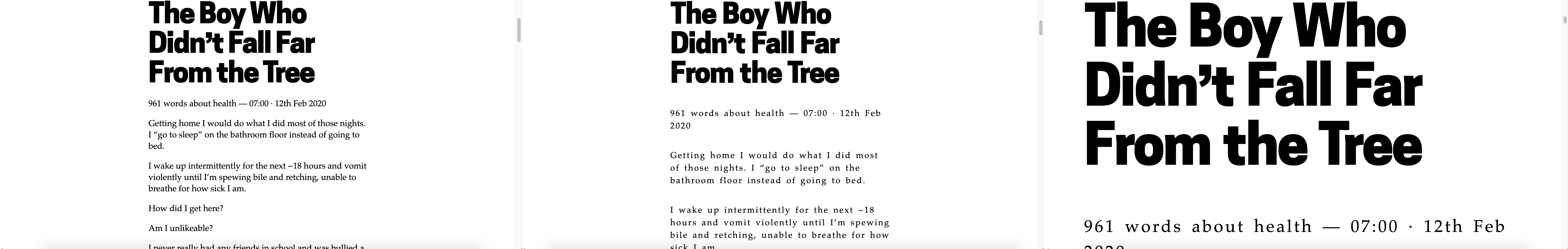
Measure or max-width
This was supposed to be a brief section about ideal measures.
Once I realised I was a couple of days into researching the fovea and saccadic eye movements, I knew I had to stop—for now.
I accept the generally accepted stance that the optimal measure for body text is between 50 and 75 characters, including spaces.
Various references for this stance include; Typographie: A Manual for Design by Emil Ruder, and The Elements of Typographic Style Applied to the Web, neither of which cite any research to back these claims up.
The research that does exist is somewhat inconsistent and I have a few thoughts as to why.
But my first assumption is that I’ve not understood it so I need to read more.
For now, based on the accepted stance, my measure is between 46 characters (narrow form factor) and 65 characters (max-width).
Space between paragraphs
In choosing between indenting each paragraph’s first line or putting space between paragraphs, I’ve decided on the latter.
Unlike print, on the web I’m working with an infinite canvas so space isn’t an issue, I need not be conservative—with white space or politics.
And now I’m done—for now—defining what the typography should be.
Is it distinguishable?
The final, as if a website was ever final, is to test how distinguishable this typography is.
The WCAG has 13 success criteria for Guideline 1.4 – Distinguishable, but for now, I’ll be focusing on only 1 of them: Text Spacing (1.4.12), which states:
In content implemented using markup languages that support the following text style properties, no loss of content or functionality occurs by setting all of the following and by changing no other style property:
Or in more simple terms:
If the visitor changes some of the styles, the website should not become a piece of shit.
These are the styles in question.
- Line height (line spacing) – at least 1.5 times the font size
- Spacing following paragraphs – at least 2 times the font size
- Letter spacing (tracking) – at least 0.12 times the font size
- Word spacing – at least 0.16 times the font size
Which, translated into CSS, becomes this:
p {
  margin: 2em 0 !important;
}
body {
  line-height: 1.5 !important;
  letter-spacing: 0.12em !important;
  word-spacing: 0.16em !important;
}
I’m using !important here because I want it to override everything—on a production site you would want to avoid using !important as much as possible.
It doesn’t break and is still distinguishable, so we’re good, for now. I will be returning to the typography later for more testing.
And there we have it, finally, some good damn typography.
I will now move my stylesheet from the HTML to its own file and take a break from the presentation layer to focus on addressing some more of those accessibility issues I found earlier.
Depends on the user agent. Desktop browsers (including Firefox) use a default value of roughly 1.2, depending on the element’s font-family. MDN Web Docs, line-height ↩