1997, Backstreet Boys was back and making sure everybody knew about it. Meanwhile, I designed and built my very first website.
I can’t find it anymore—it was hosted on Geocities—but I remember its fluorescent green text set against a black background—I was cool like that.
The World Wide Web Consortium (W3C) had released their first recommendation for Cascading Style Sheets (CSS) version 1 a few months earlier. Defined as a declarative programming language, CSS would be used for describing and constraint the presentation of a document written in a markup language like HTML.
Before CSS if you wanted to style anything, your only choice were to use inline elements <h1><font size=“+6“> Chapter 1. </font></h1>, on every single element.
But with CSS version 1 came unprecedented power, now any element could appear as almost any other element through reusable class-names. So the previous example would become, <h1 class=“size”>Chapter 1.</h1>, where the styles could appear in an external document.
That’s when things started going wrong.
The specifications themselves even address this in a foreboding sentence:
Relying on this power is not recommended, since it removes the level of structure that has a universal meaning (HTML elements).
“Meaning,” such a simple word, yet with so much purpose.
Take the a element, for example, assign it a destination and it becomes a link. Aside from forms, links are one of the most basic fundamental building blocks of the web. Press a link, and you move to another page or another place within the same page.
But when designers look at links, they often don’t see meaning, they see presentation.
“It doesn’t look good,” they say as if that’s its only job.
In hindsight, maybe Sir Tim Berners-Lee should have given it more thought when he at random decides to make links blue by default.
It doesn’t have the best contrast against surrounding text and it’s often the first colour we lose as we age.
But the underline, now that was a stroke of genius.
Imagine paragraphs of text and within that text, some words have special meaning. Imagine that meaning is, “there’s more stuff here, these words take you to another place, filled with more words.”
How would you communicate that meaning?
Do you give the font more weight? No, it carries too much meaning already. Strikethrough? No, too in the way. Do you italicise the text? Again, too much meaning.
No, the underline is by far the best approach. By sitting underneath the descenders (the parts of the letter below the imagined line you write on) it doesn’t interfere with the letters themselves.
It had less to no historical meaning so less unlearning for the people who had to deal with this new medium we now call the web.
And if you’ve ever spent more than a few minutes trying to find the Unsubscribe link in an email you have personal experience with just how much meaning it has today.
Without this affordance, one of the fundamentals of the web stops working, it stops being the very thing it was designed to be.
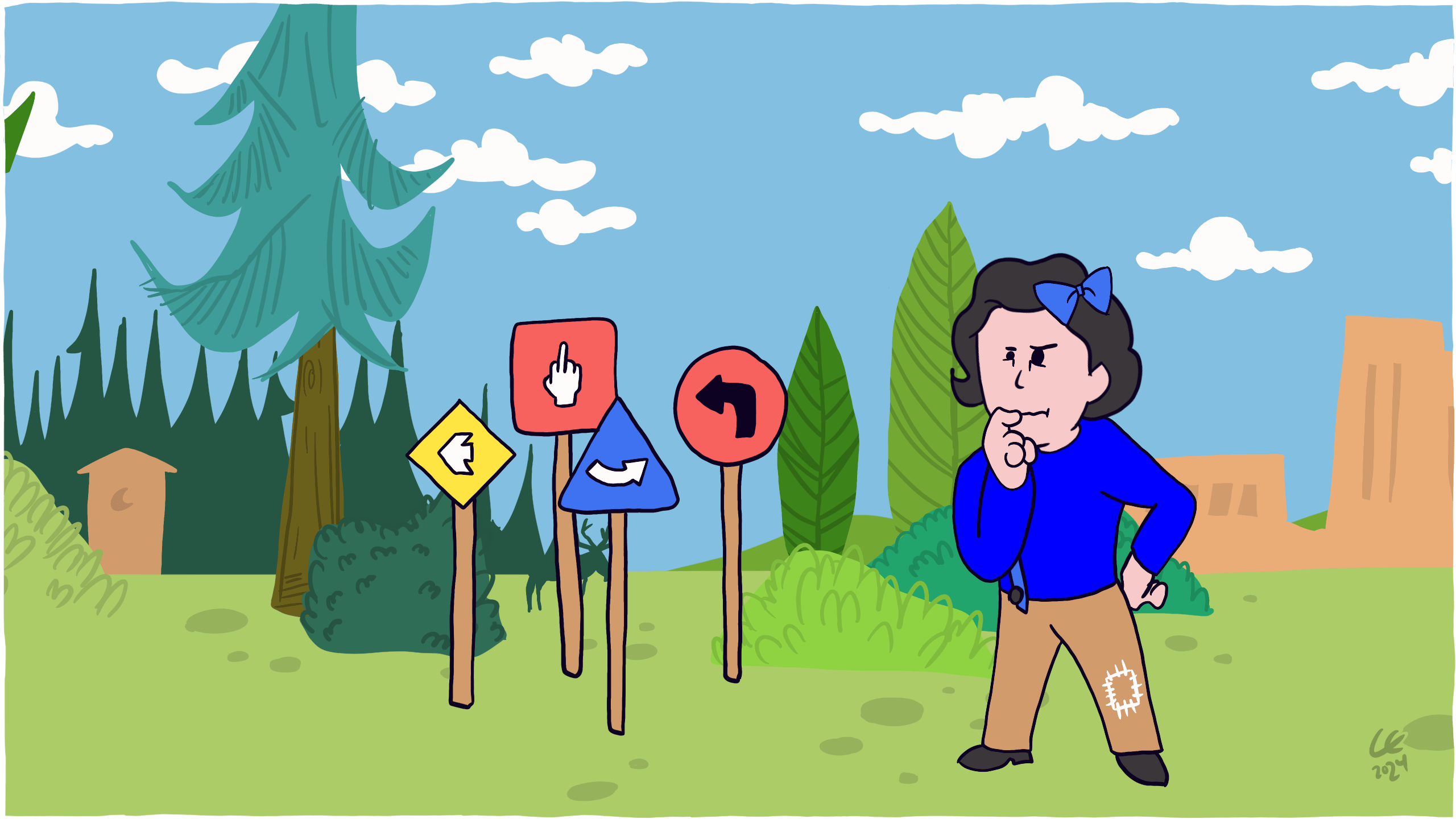
Now, 23 years later, everywhere we look on the web, links are mistreated and have their affordance and behaviour stripped away. All in the name of design and minimalism.
We’re so used to seeing links in the worst possible way that it’s a hard sell to imagine anything else.
But what if we did? What if we imagined links in the best possible way, instead of the worst?
What would that be like?
Let’s start with a destination because, without that, it isn’t a link at all.
Our example destination will be: https://www.gov.uk/contact.
Writing good links texts are hard.
Writing good links text itself is a skill, a specialism in copywriting and microcopy.
Links without any text at all are one of the most common (58%) accessibility issues on the web, so this is the first thing we’ll address.
And when we do have link texts, they are often in the form of, “click here”, “read more” and “link,” which are all terrible because outside the context of the surrounding content we have no idea where they lead.
To write link texts, ask yourself, “what’s the least amount of words that convey the most amount of meaning?”
For a page with details on how to contact someone, it would be “Contact us”, instead of “These are the ways you can contact us,” or, “Click here to contact us”, both of which are too wordy.
Sidenote: Don’t use the title attribute, ever.
Preserving the meaningful element
The a element carries with it all that meaning for you, it allows keyboards to understand how to react to different presses.
It allows Assistive Technology, such as JAWS to announce, “Link” before the text.
Don’t replace a fundamental piece of the web with meaningless span elements or a elements without destinations—using Javascript to replicate link behaviour—instead, use a link.
Presenting a link as a link
Does it look like a link?
As an interactive element, its potential and how it responds to someone interacting with it should be made clear by how it changes.
- Link: I’m a link, interact with me
- Visited: You’ve already been here (a native breadcrumb)
- Hover: Why yes, you are hovering a pointing device over me and not my friend next to me
- Focus: I have focus, using a keyboard would allow you to activate me using “Enter”
- Active: I’m usually only seen for a split second but I provide visual feedback that I was indeed pressed
It’s important to present all these states so that they stand out from one another—and in that order.
They have different meaning and removing any of them, strips away one of the fundamental properties of links.
To summarise, links have special meaning which we should preserve through affordance.
We define good affordance as; built with meaning, stand out from normal text and embody enough size to be pressable (44px), change when interacted with, and convey to screen readers and conventional browsers alike what content the link will open or where it will go.
In short, underline your fucking links, please.
Know someone who would benefit from this article? Share it with them.