Or… “How I thought I was smarter than Microsoft’s Logo Designer”.
I’m busy designing UX/UI Icons, which I hopefully will be able to disclose a bit more as it gets closer to completion. But this post isn’t about that, but rather about me needing a small but well earned break from designing the icons. So what do I do? I design something else of course…
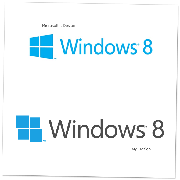
To my knowledge I am not the only one who has complained that Microsoft’s upcoming “Windows 8” logo looks.. well.. “not so good” seems to be the general consent. It’s one thing to criticize and complain about how something could be better, it’s a completely different thing to actually do something about it. For instance, I respect the second one significantly more than I respect the first one. Maybe their logo is a “love it or hate it” -approach to design and everything in it is by choice, I sure hope so. I can respect a conscience choice even if I don’t agree with it.
But I don’t know.
And since I partly agree with some of the criticism that’s been floating around I thought “Surely I can do better than that!”. Not so surprisingly enough, that is actually where many of my projects start from. Well.. enough talk. This post wasn’t go to be about my narcissistic tendencies.
The short version is: I don’t like Microsoft’s new “Windows 8” logo so I designed a new (ish) one using Microsoft’s own Visual Guidelines for their Metro interface. Feedback and opinions are of course greatly appreciated, because I am actually very curious to hear what other people think.. Did I do a better job at it?