Back in 2015, during the redesign where I didn’t document any of my thinking, I made an expectation that proves that rule by documenting my thoughts on spacing in design.
The experiment and its question back then, was: could I use the same principles and methods that guide the production of books, to guide harmonious design for the web?
The canons of page construction are a set of principles in the field of book design used to describe the ways that page proportions, margins and type areas (print spaces) of books are constructed. –Canons of page construction, Wikipedia
I looked at the work of Raúl M Rosarivo, Jan Tschichold, etc. and their canons of page construction.
Interpreting these principles I then applied them to my work through CSS Viewport Units.
For this reboot, I wanted to evolve these principles. I wanted to turn the metaphorical page by moving everything as if I had turned a literal page.
So I did and I tried changing things around, moving stuff but after more days than I care to admit I realised that it created more problems than it solved.
Which shouldn’t have come as a surprise, as I was doing it because I wanted to change it, not because the content needed it. I was trying to served my ego and nothing more.
Canon v1 is great, so let’s roll the fuck with it and evolve it to serve the content instead of my ego.
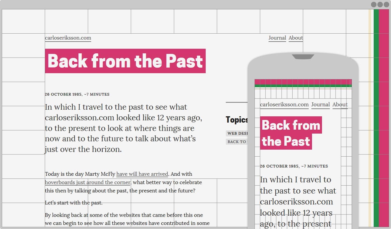
In practical terms, I define canon v1 as a 9x9 CSS Viewport Unit grid, this guides the spacing and layout on things that can’t be guided by the body text.
Laying it all out
In terms of evolving the canon, v2 will need to support the following changes;
- an increase of information
- different kinds of information
However, everything starts from the content itself because the content on any given page is always the most important thing, it’s that page’s raison d’être (reason for being). this, in turn, informs how the remaining sections are laid out.
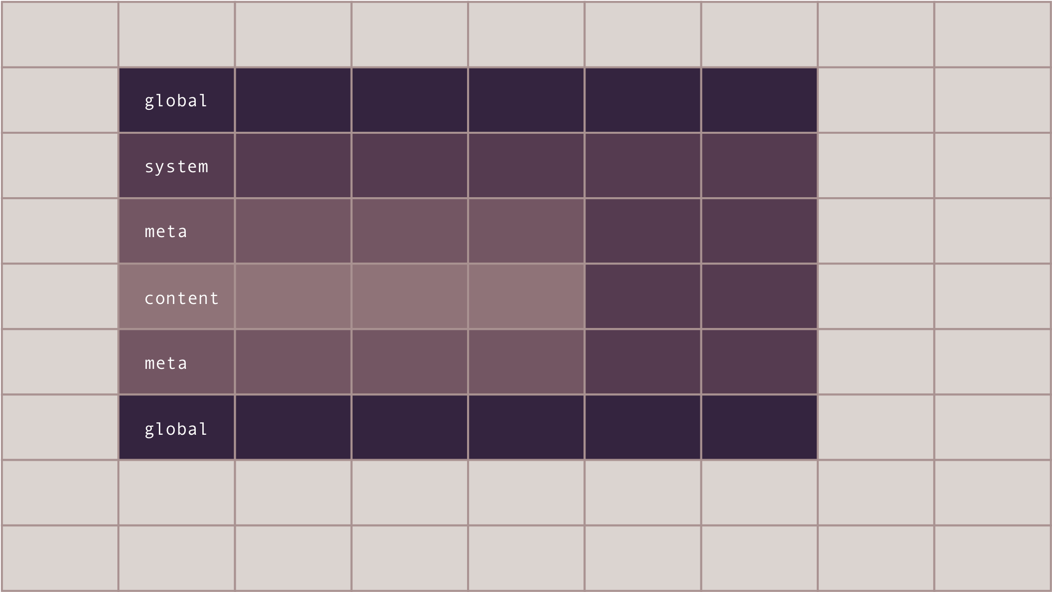
For these remaining sections—the meta layout—it helps me to think in terms of broad on-page sections. A page often has combinations of persistent sections, we often call them globals, and contextual sections, such as a notice to say that, “Yes, Carlos, you did just add a note.”
I then write down each of my sections in a list because doing so forces me to think about them in a linear way—which in turn informs both source and visual order.
I shouldn’t be visually rearranging things in such a way that the Tab order becomes unpredictable.
- globals (start, such as navigation, beta/privacy-violation notice)
- system content (such as system notice)
- meta content (before; such as content warnings)
- content
- meta content (after; such as related navigation)
- system content (such as cms navigation)
- globals (end, such as navigation)
Thinking about on-page sections this way also helps remind me about the almost paradoxical state that although the content is most important, it’s rarely first.
I have some ideas for how to address this but we’re getting ahead of ourselves.
What I then call layouts, are basically how the content section itself, and its raison d’être, changes from page to page.
Based on my site so far—which is likely to remain constant—I’ve identified 3 basic layouts I’ll need:
- a listing
- a details
- a form
With a few exceptions, such as the homepage which will need a hybrid approach, these 3 layouts and the meta layout covers most of my design needs in broad terms.
Okay, so now I’ve got layouts, which tells me how the Things are placed, and my canon, which is the Space between those Things—now what?
Now I get to work again.
I’ve got the Notes content which already needs to use these 3 layouts so that seems like a good place to stress-test canon v2.
So here’s my todo list:
- globals (start, such as navigation, beta/privacy-violation notice)
- system content (such as system notice)
- meta content (before; such as content warnings)
- content
- meta content (after; such as related navigation)
- system content (such as cms navigation)
- globals (end, such as navigation)
- a listing layout
- a details layout
- a form layout
Eventually, much like the content outline for journal entries, I will probably need to document the outline of each content type as well, but I’ll save that for another day.